How Can We Help?
Styling
- Body Styling
- Navigation Bar Styling
- Sub menu Styling
- Mobile Menu Styling
- Top Bar Styling
- Footer Styling
Styling – Body Settings
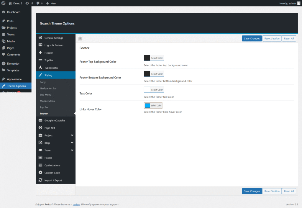
The Body Styling section in the GoArch theme allows you to control the global color scheme of your website. These settings define the default text color, background color, and primary/secondary brand colors used across the theme.
You can access these options from:
WordPress Dashboard → GoArch Theme Options → Styling → Body
Text Color
Option: Text Color
This option controls the default text color used throughout the website, including paragraphs, general content, and standard text elements.
- Click Select Color to choose a color
- The selected color applies globally unless overridden by custom styles
💡 Tip: Choose a high-contrast color for better readability.
Body Background Color
Option: Body Background Color
This setting controls the main background color of the website.
- Affects all pages and layouts
- Useful for light or dark theme designs
Example uses:
- White or light gray for clean layouts
- Dark colors for modern or creative designs
Primary Color
Option: Primary Color
The primary color is the main brand color used throughout the theme.
It is commonly applied to:
- Buttons
- Links
- Icons
- Highlights
- Active elements
🎨 This color defines your brand identity across the website.
Primary Hover Color
Option: Primary Hover Color
This color is applied when users hover over elements using the primary color.
Common hover elements include:
- Buttons
- Links
- Interactive UI components
💡 Use a slightly darker or lighter shade of the primary color for smooth hover effects.
Secondary Color
Option: Secondary Color
The secondary color is used as an additional accent color in the theme.
It may be applied to:
- Secondary buttons
- Badges
- Labels
- Decorative elements
This color helps create visual contrast while maintaining design harmony.
Secondary Hover Color
Option: Secondary Hover Color
This option controls the hover state of elements using the secondary color.
- Enhances user interaction feedback
- Improves overall user experience
🎯 Recommended to use a complementary shade of the secondary color.
Navigation Bar Styling Settings
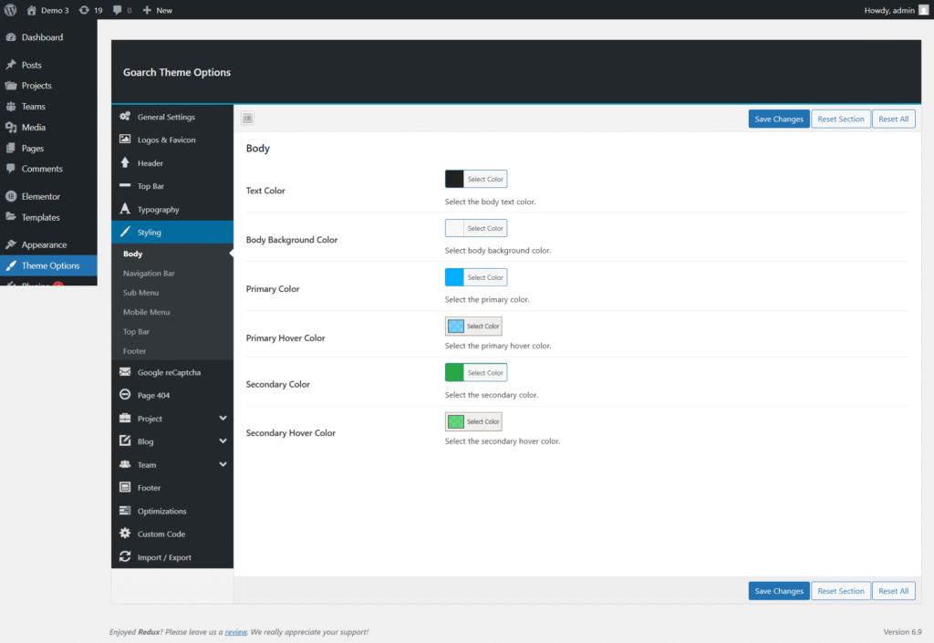
This section of the GoArch Theme Options allows you to customize the appearance of your website’s Navigation Bar (Header Menu). All options shown in the screenshot are available under:
WordPress Dashboard → Theme Options → Styling → Navigation Bar
These settings help you control colors, text behavior, and borders of the main header menu to match your brand identity.
Navigation Bar Options Overview
1. Header Background Color
Purpose:
Controls the background color of the website header where the navigation menu is displayed.
How to use:
- Click Select Color
- Choose a color using the color picker or enter a HEX/RGB value
- Save changes
Tip:
Use darker colors for modern designs and lighter colors for minimal or corporate layouts.
2. Menu Tabs Text Color
Purpose:
Defines the default text color of the navigation menu items.
Recommended use:
- Ensure sufficient contrast between text color and header background
- Improves readability and accessibility
3. Menu Tabs Text Color on Hover
Purpose:
Sets the color of menu items when users hover over them.
Best practices:
- Use an accent or brand color
- Make sure the hover color clearly stands out from the normal text color
4. Border Bottom
Purpose:
Adds a bottom border to the navigation bar for visual separation.
Available controls:
- Top / Right / Bottom / Left border width
- Border style (Solid, Dashed, Dotted, etc.)
Example uses:
- Add a thin solid border for a clean layout
- Use no border for a flat, modern design
5. Border Bottom Color
Purpose:
Controls the color of the bottom border applied to the navigation bar.
Note:
This option is visible only if a border width greater than 0 is set.
Sub Menu Styling Settings
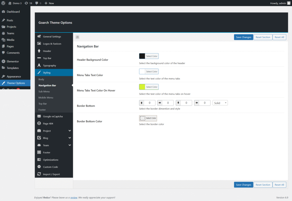
The Sub Menu styling options in the GoArch theme allow you to customize the appearance of dropdown menus that appear when users hover over main navigation items. These settings help ensure clarity, usability, and visual consistency across your site.
You can access these options from:
WordPress Dashboard → Theme Options → Styling → Sub Menu
Sub Menu Options Overview
1. Background Color
Purpose:
Sets the background color of the dropdown (sub) menu.
How it works:
- Applies to all submenu levels
- Affects the entire dropdown panel
Design tip:
Use a slightly different shade than the main header to visually separate submenus while maintaining harmony.
2. Menu Tabs Text Color
Purpose:
Defines the default text color for submenu items.
Best practices:
- Choose a color with strong contrast against the submenu background
- Improves readability and accessibility
3. Menu Tabs Text Color on Hover
Purpose:
Controls the text color when a user hovers over a submenu item.
Recommended use:
- Use your primary or accent brand color
- Make hover states clearly visible to guide user interaction
4. Menu Tabs Text Background Color on Hover
Purpose:
Sets the background color of submenu items on hover.
How this helps:
- Enhances hover feedback
- Improves navigation usability, especially on large menus
Tip:
Avoid very dark hover backgrounds unless text color is light enough for readability.
5. Border Color
Purpose:
Controls the border color of the submenu container or submenu items (depending on theme structure).
Usage notes:
- Use subtle colors for a clean, modern look
- Borders can help separate submenu items visually
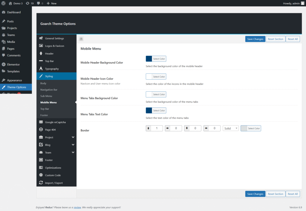
Mobile Menu Styling Settings
The Mobile Menu settings in the GoArch theme allow you to fully customize the appearance of your website’s navigation on mobile and tablet devices. These options ensure that your menu remains clear, accessible, and visually consistent across smaller screens.
You can find these settings at:
WordPress Dashboard → Theme Options → Styling → Mobile Menu
Mobile Menu Options Overview
1. Mobile Header Background Color
Purpose:
Sets the background color of the mobile header area where the logo and menu icon are displayed.
Usage tips:
- Choose a color that matches or complements your desktop header
- Ensure enough contrast with icons and text for visibility
2. Mobile Header Icon Color
Purpose:
Controls the color of the mobile navigation icons, including:
- Hamburger (navicon) menu icon
- User/account menu icon (if enabled)
Best practice:
Use a high-contrast color so icons are easily recognizable on small screens.
3. Menu Tabs Background Color
Purpose:
Defines the background color of the mobile menu items when the menu is opened.
Design note:
A clean, neutral background improves readability and touch accuracy.
4. Menu Tabs Text Color
Purpose:
Sets the text color of menu items inside the mobile menu.
Accessibility tip:
Ensure strong contrast between text and background for better readability on mobile devices.
5. Border
Purpose:
Adds a border around the mobile menu or menu items for better separation and structure.
Available controls:
- Border width (Top, Right, Bottom, Left)
- Border style (Solid, Dashed, Dotted, etc.)
- Border color
Recommended use:
Use subtle borders to visually separate menu items without cluttering the interface.
Top Bar Styling Settings
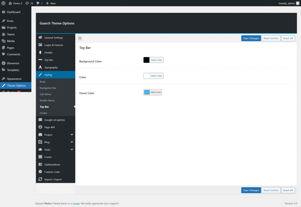
The Top Bar settings in the GoArch theme allow you to customize the appearance of the top-most section of your website. This area is often used for contact details, social icons, announcements, or secondary navigation, and proper styling helps it blend seamlessly with your site’s overall design.
You can find these settings at:
WordPress Dashboard → Theme Options → Styling → Top Bar
Top Bar Options Overview
1. Background Color
Purpose:
Sets the background color of the top bar area across the website.
Usage tips:
- Choose a color that complements your main header and brand palette
- Dark backgrounds work well when paired with light text for visibility
2. Text Color
Purpose:
Controls the default color of all text and icons displayed within the top bar, including links and informational text.
Best practice:
- Ensure strong contrast between text and background
- Use a consistent color scheme that matches your site typography
3. Hover Color
Purpose:
Defines the color applied to links and interactive elements when users hover over them in the top bar.
Design note:
- Use an accent color to clearly indicate interactivity
- Hover colors should stand out without clashing with the main color scheme
Footer Styling Settings
The Footer settings in the GoArch theme allow you to customize the appearance of the bottom section of your website. The footer typically contains important information such as copyright text, navigation links, contact details, and widgets. These options help ensure the footer remains visually balanced and consistent with your overall site design.
You can find these settings at:
WordPress Dashboard → Theme Options → Styling → Footer
Footer Options Overview
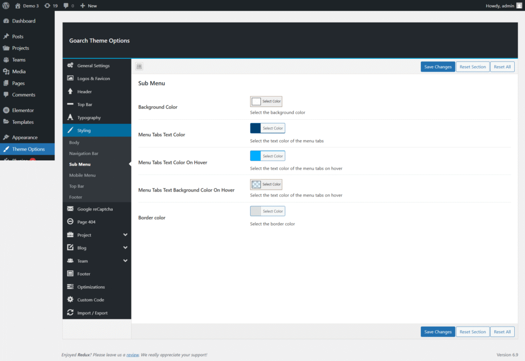
1. Footer Top Background Color
Purpose:
Sets the background color of the upper section of the footer area.
Usage tips:
- Use a color that visually separates the footer from the main content
- Dark or neutral tones work well for footer widget areas
2. Footer Bottom Background Color
Purpose:
Controls the background color of the lower footer section, commonly used for copyright text.
Design note:
- This area can use a slightly darker or lighter shade than the footer top
- Helps create a clear visual hierarchy within the footer
3. Text Color
Purpose:
Defines the color of all text displayed in the footer, including widget content and copyright text.
Accessibility tip:
- Ensure sufficient contrast between text and background
- Avoid overly bright colors that may reduce readability
4. Links Hover Color
Purpose:
Sets the hover color for links located in the footer area.
Best practice:
- Use an accent color to indicate interactivity
- Keep hover colors consistent with your site’s global link styling