How Can We Help?
Logos & Favicon
Logos & Favicon – Overview
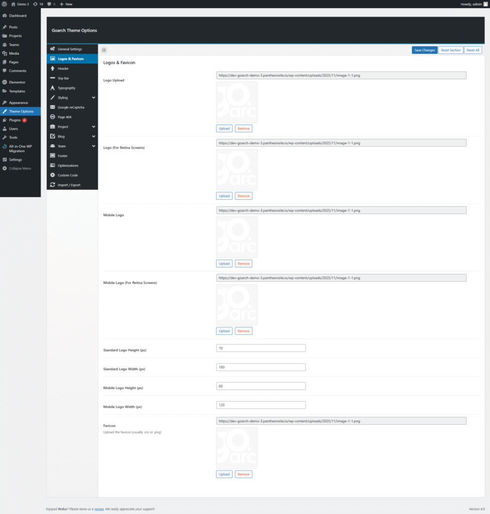
The Logos & Favicon panel in the GoArch Theme Options lets you upload and control all site logo versions plus the favicon, including separate images for desktop, mobile, and retina screens. These settings ensure the brand looks sharp and consistent on every device.
Logo Upload (Desktop)
This field is used to upload the main site logo that appears in the header on standard desktop screens. Click Upload, select your logo image from the Media Library or computer, and then click Save Changes to apply.
- Recommended format: PNG or SVG with transparent background for best visual integration in the header.
- Use a horizontally oriented logo to fit typical header layouts in GoArch demo designs.
Logo (For Retina Screens)
This option is for the retina version of the desktop logo, displayed on high‑resolution devices (e.g., newer phones, tablets, and Mac screens). Upload an image exactly 2x the size of the standard desktop logo to keep it crisp on retina displays.
- Keep the aspect ratio the same as the standard logo to prevent stretching.
- File name and design should match the main logo for consistent branding.
Mobile Logo
The Mobile Logo field controls the logo used in the mobile header or mobile menu trigger area. This lets you use a simplified or stacked version of the logo that stays readable on small screens.
- Choose a version with fewer details or thicker lines for better legibility on phones.
- Dimensions are usually smaller than the desktop logo; you can fine‑tune height and width in the fields below.
Mobile Logo (For Retina Screens)
This field is for the retina mobile logo, again at 2x resolution of the normal mobile logo, used on high‑density mobile displays. Uploading a dedicated retina mobile logo keeps the brand sharp even in compact mobile headers.
- Match the design of the regular mobile logo; only the resolution should differ.
- Use PNG with transparent background for smooth overlay on header backgrounds.
Logo Dimensions (Standard)
Two fields define the dimensions of the main desktop logo as shown in the screenshot:
- Standard Logo Height (px) – Sets the display height of the primary desktop logo in pixels.
- Standard Logo Width (px) – Sets the display width; combined with height it controls the logo’s space in the header.
Adjust these values until the logo fits nicely inside the GoArch header without overlapping the menu or shrinking too much.
Logo Dimensions (Mobile)
Below the standard size fields you can set separate dimensions for the mobile logo:
- Mobile Logo Height (px) – Controls how tall the logo appears on mobile devices.
- Mobile Logo Width (px) – Controls the width; this helps keep the logo balanced next to the mobile menu icon.
Using smaller values than the desktop logo prevents the header from becoming too tall on phones.
Favicon
The Favicon field is used to upload the small icon that appears in browser tabs, bookmarks, and mobile shortcuts. Click Upload, select an icon (usually 16×16, 32×32, or 48×48 pixels), and save your changes.
- Recommended format: ICO, PNG, or SVG, with a simple version of your mark for clarity at tiny sizes.
- The favicon helps users recognize your architecture site among multiple open tabs.
Saving and Resetting
Use the blue Save Changes button in the top‑right of the panel to store your logo and favicon settings. If you want to discard changes for this section only, click Reset Section, or Reset All to revert the entire Theme Options panel to default values.