
How Can We Help?
GoArch Blog Posts Grid
The Goarch Blog Posts Grid widget is an advanced content-delivery element designed to fetch and present your WordPress blog posts, case studies, or design portfolios in elegant grid formats. It features clean sorting options, layout styles, and granular metadata visibility controls, making it an excellent choice for modern architectural logs, editorial spaces, and corporate newsrooms.
Feature Overview
- Layout Configurations: Switch between a distinctive asymmetric featured presentation block (Demo 1) or a classic, clean multi-column category-filtered archive grid (Demo 2).
- Targeted Query Filtering: Isolate exactly which posts appear on the front end by defining targeted categories or inputting a custom comma-separated list of precise post IDs.
- Image Scale Settings: Change featured thumbnail rendering proportions to optimize page performance and layout clarity.
- Complete Style Customization: Fully customize colors, typography, border profiles, shadows, and spacing for layout columns, meta tags, step badges, and action links.
Step-by-Step Instructions
Follow these clear instructional steps to deploy and configure the Goarch Blog Posts Grid widget:
- Open your target page container using your active Elementor page builder interface.
- Locate Goarch Blog Posts Grid within the elements index area on the left side.
- Drag the widget item and drop it directly onto your designated layout canvas container.
- Set your grid version, content target parameters, and metadata rules under the Content tab.
- Move to the Style tab to systematically colorize text, configure card boundaries, and adjust typography sizing to match your theme.
Explanation of Settings
Content Tab
The Content tab manages your core post querying loops, featured image resolutions, and front-end layout variants.
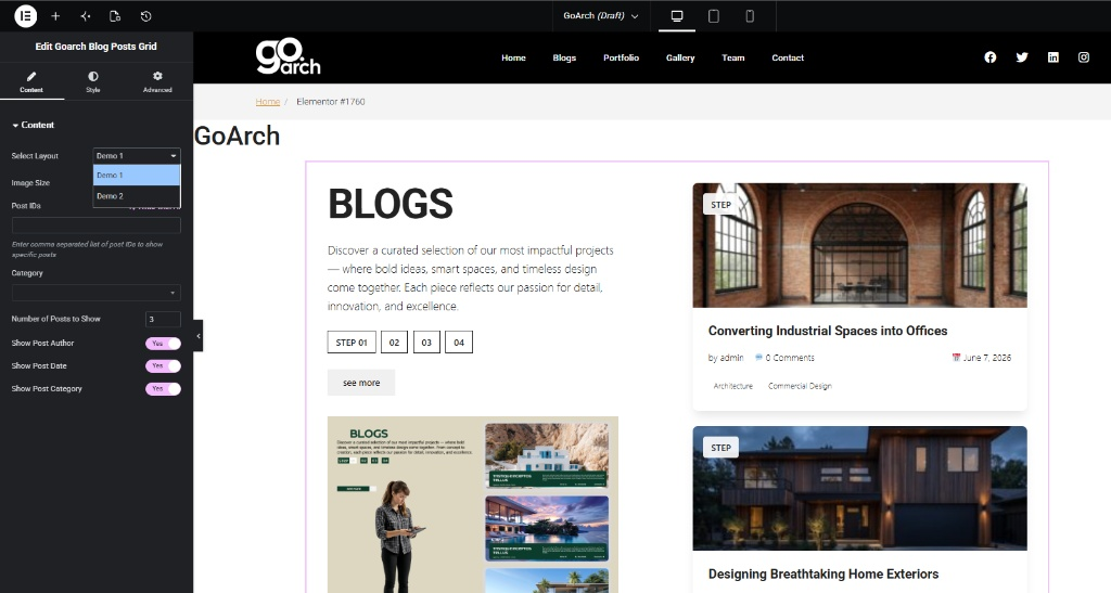
Grid Configurations & Query Settings
- Select Layout: Toggle between distinct layout framework styles to match the structural architecture of your webpage.
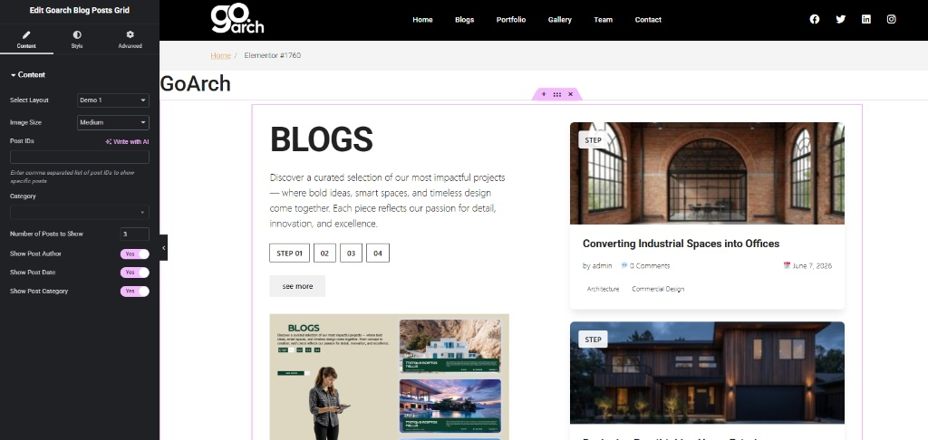
- Demo 1: Renders an asymmetric split view featuring a static intro text box on the left accompanied by dynamic post listings stacked on the right side.
- Demo 2: Generates a traditional, clean horizontal card archive topped with an interactive live category-filtering bar.
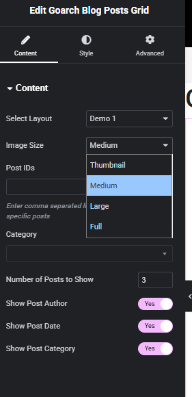
- Image Size: Choose an appropriate image dimension preset from the open menu framework to balance visual rendering quality with fast asset loading performance. Options include Thumbnail, Medium, Large, and Full.
- Post IDs: To display specific articles instead of an automated reverse-chronological post stream, enter a comma-separated list of individual numeric WordPress post IDs.
- Category: Filter your posts by selecting particular taxonomy categories from your database dropdown menu. Leave this empty to scan and query all categories.
- Number of Posts to Show: Define the maximum threshold of post blocks allowed to render within the active grid section (e.g.,
3). - Show Post Author / Date / Category: Individual visibility toggles configured to display or entirely hide writer names, publish dates, and classification tags on each post card layout.
Demo 2 Specific Layout Controls
When switching your active container framework choice to Demo 2, a layout-specific filter parameter is exposed to enhance archive sorting.
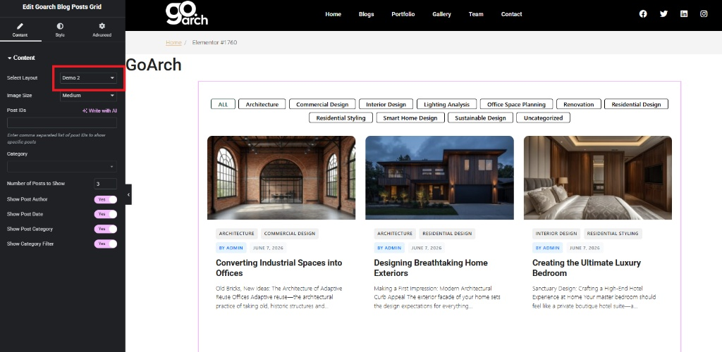
- Show Category Filter: Toggle to Yes to append an interactive horizontal navigation bar above the item cards, allowing visitors to filter posts on the fly (e.g., sorting between Architecture, Commercial Design, or Interior Design).
Style Tab
The Style tab provides deep granular design layers to format background layers, title weights, custom badges, and responsive action links.
Common Styles
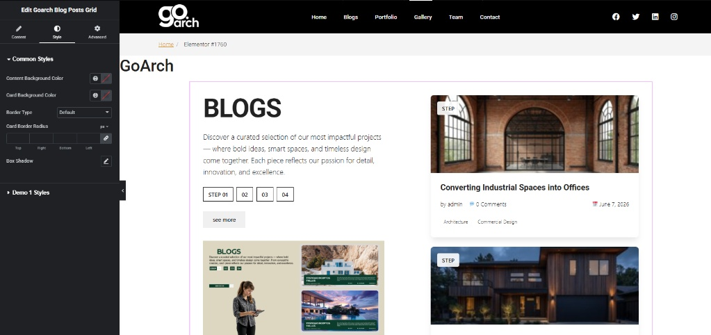
- Content Background Color: Edit the overall base backdrop color container mapping out the general background area behind the widget grid framework.
- Card Background Color: Modify the isolated inner container background properties applied specifically behind each individual post card block.
- Border Type & Radius: Apply distinct bounding borders around your items and configure rounded corners using linked or independent pixel values.
- Box Shadow: Open the shadow generation matrix to implement elegant drop shadows that elevate cards off the page surface.
Demo 1 Styles
This submenu becomes active exclusively when your grid layout parameter is set to Demo 1, granting control over specific step-by-step layout variations.
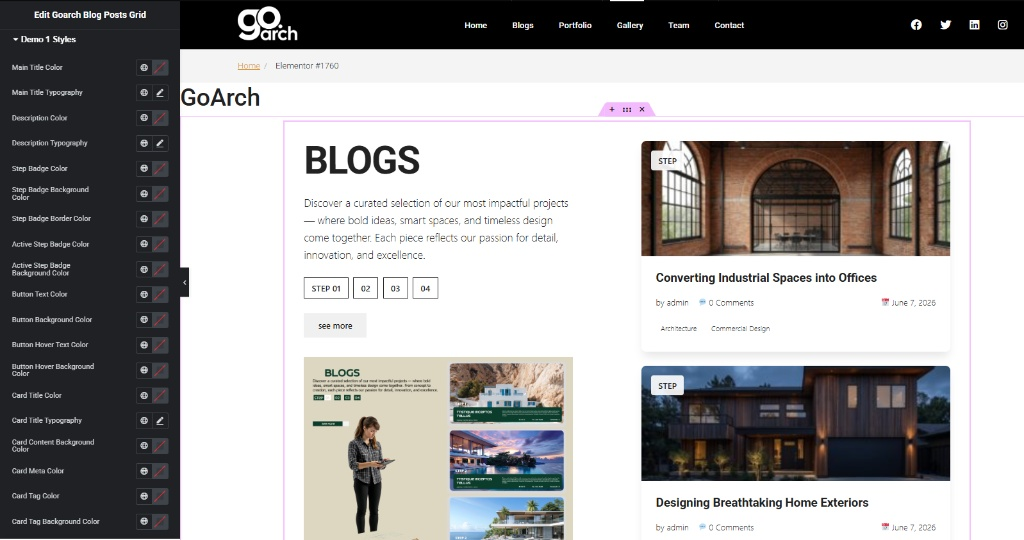
- Main Title & Description: Assign unique font weights, text transform values, line heights, and branding colors specifically to the primary left-aligned introductory block headers.
- Step Badge Customizers: Configure independent text colors, border styles, background states, and active selection highlights for the chronological step item buttons (e.g.,
STEP 01,02,03). - Button Controls: Style the text properties, bounding colors, and mouse-hover animation transitions for the dynamic action links (e.g.,
see more). - Card Specific Metrics: Refine individual title fonts, background overlay paints, tag labels, and meta info layouts within the right-aligned post feed columns.
Advanced Tab
The Advanced Tab includes Elementor’s core parent-level technical parameters. This section is ideal for setting custom padding metrics, applying entrance scroll visibility animations, declaring targeted CSS classes or ID anchors for advanced developers, or mapping responsive rules to hide or show components based on whether a visitor views your page via desktop, tablet, or mobile smartphone viewports.
Tips & Best Practices
- Optimize Excerpt Lengths: When using the card formats found in Demo 2, keep your underlying post excerpts concise and uniform. Consistent text blocks keep the cards aligned horizontally without awkward vertical variations.
- Leverage the Image Size Selector: Avoid defaulting to the Full image resolution setting if your images are high-res files. Dropping down to the Medium or Large preset scales down the file delivery weight, giving your site a helpful performance boost.
- Curate with Post IDs: For landing pages or sales funnels, avoid using a broad, automated category stream. Instead, manually pin high-converting case studies by inputting their exact numeric values inside the Post IDs text field.
Troubleshooting
Newly published blog articles are not populating inside the grid layout
First, confirm whether you have hardcoded values remaining inside the Post IDs parameter box under your Content tab settings. If that input field contains old IDs, the widget locks onto those items and skips your latest updates. Empty out the Post IDs text block to restore normal chronological fetching.
Dynamic filtering tabs are missing from the header region in the Demo 2 layout
Expand your Content settings menu block and ensure the Show Category Filter toggle is turned on. If it is active but the tabs still don’t show up, check that the blog posts being loaded actually have categories assigned to them in WordPress. If all queried posts are uncategorized, the filter bar automatically hides itself.