
How Can We Help?
GoArch Empty Space
The Goarch Empty Space widget is a clean utility element designed to insert adjustable vertical gaps between different content blocks or layout sections on your page. Instead of relying on complex margin or padding configurations across multiple adjacent items, this widget provides a visual and intuitive way to manage structural breathing room inside your layout.
Feature Overview
- Responsive Height Adjustments: Fine-tune structural height gaps independently across desktop, tablet, and mobile viewing modes.
- Integrated Background Fills: Optionally apply a color layout directly inside the spacer block to create colored section blocks or custom block-style dividers.
Step-by-Step Instructions
Follow these steps to safely add and configure a Goarch Empty Space block:
- Launch your page layout inside the Elementor editor panel.
- In the left-hand search bar, type Goarch Empty Space.
- Drag the widget from the panel and drop it exactly between the two design elements or layout sections that require separation.
- Modify the clearance dimensions directly within the active Content tab configuration panel.
Explanation of Settings
Content Tab
The Content tab houses the primary measurement and color controls needed to format your spacing block parameters.
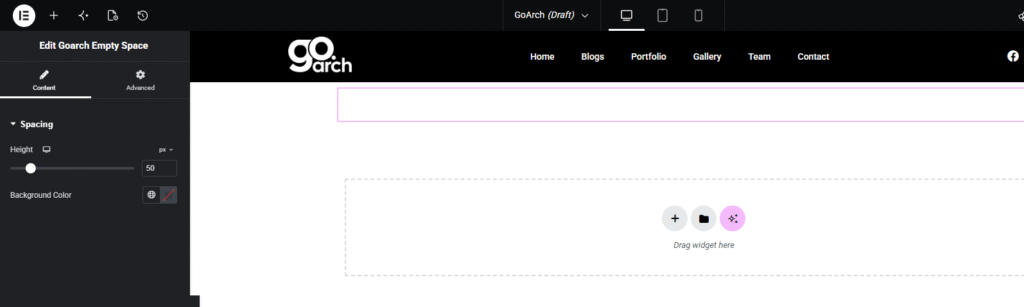
Spacing
- Height: Drag the horizontal range slider or enter a precise numeric value (e.g.,
50) into the value field to dictate the exact vertical size of your empty space. Use the drop-down unit selector to switch measurement units (e.g.,px). Click the responsive device icon next to the label to define alternative heights for tablet and mobile screens. - Background Color: Click the square swatch area or global icon to choose a custom background fill color for the spacer block. Leave this clear or transparent to retain standard whitespace formatting.
Advanced Tab
The Advanced Tab populates native Elementor engine layout behaviors. Use this section if your design requires custom container dimensions, entrance animations, custom CSS class/ID naming hooks, or conditional viewport settings to hide or show the spacing element entirely on specific hardware configurations.
Tips & Best Practices
- Audit Your Mobile Layouts: A spacing gap of
80pxthat looks perfect on an expansive desktop display can make mobile screens look disconnected. Always click the device layout icon next to the Height option to preview and scale down your clearance constraints for smaller viewports. - Create Minimalist Divider Blocks: You can repurpose this component into a modern, solid separator rule. Set a small vertical limit (such as
4pxor8px) and choose a solid brand accent using the Background Color picker to form thick graphic accent lines. - Maintain Spatial Consistency: Establish standard spacing intervals throughout your website development process (e.g., consistently using
30pxfor minor element gaps and60pxfor major column separations) to cultivate professional proportions.