
How Can We Help?
Services
The Services custom post type in the Goarch theme offers a structured workflow to present your firm’s professional capabilities, design consultations, and technical solutions. Operating independently from your regular portfolio items and team roster, this module transforms standard pages into an interactive service directory. It includes targeted metadata blocks to specify service durations, clear pricing matrices, delivery methodologies, and custom graphical icon visual cues.
Feature Overview
- Structured Commercial Offerings: Showcase specific commercial fields (such as Bespoke Residential Architectural Design or Photorealistic 3D Interior Rendering) cleanly within an organized index layout.
- Granular Service Taxonomy Control: Group business capabilities dynamically using a customized, non-cluttering category tree framework.
- Dedicated Metadata Canvas: Add vital consumer data metrics like custom pricing units, duration values, deployment methods, and service prerequisites into dedicated fields.
- FontAwesome Icon Support: Embed custom, lightweight font iconography strings directly to introduce each individual solution card visually.
Step-by-Step Instructions
Follow these clear, administrative management actions to publish and structure your service catalog items:
- Log in to your WordPress dashboard, navigate to the sidebar menu panel, and locate the custom Services menu tab.
- Click on Categories to pre-define your active operational fields (e.g., Interior Design, Landscape Design, Renovation) before creating entries.
- Return to the sidebar drawer and select Add New Service to open a fresh creation canvas.
- Enter the public title of your technical capability (e.g., Sustainable & Green Architecture Consultation) inside the headline title field.
- Move down past the standard block editor window to access the custom Service Details meta panel matrix.
- Complete the explicit text fields, detailing pricing brackets, execution durations, and listing specific key benefits sequentially.
- Map relevant categories via the right-side checklist panel, and set a core cover file link using the Set featured image tool.
- Hit Publish to make your new technical service live across front-end directory pages.
Explanation of Settings
Services Dashboard List
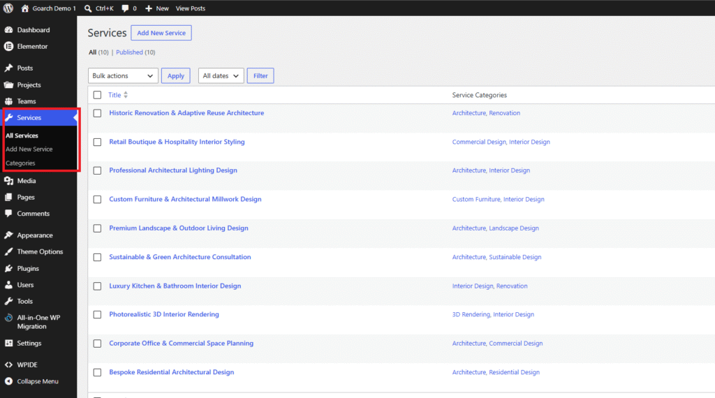
- All Services: Opens your global service index table, displaying every draft and active capability configured in your system. As shown in
image_2af397.png, this tracking node currently displays 10 active, published records. - Service Categories Column: Lists the specific operational taxonomy classifications (such as Commercial Design, Architecture, or 3D Rendering) mapped to individual rows to help verify site structure at a glance.
Add New Service & Meta Interface
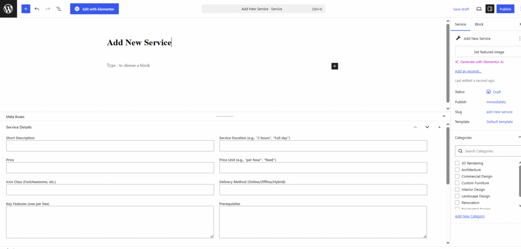
- Title Input: Define the primary operational name of the service option.
- Set Featured Image: Link the main banner graphic or visual mockup background used behind the service card overlay.
- Categories Selector Sidebar: Toggle target checkmarks to tie the item to relevant taxonomy tracks.
Meta Boxes -> Service Details
This specialized backend panel houses input fields to display clear operational specifications alongside your service overviews:
- Short Description: Enter a concise, one-to-two sentence summary layout blurb to describe the service within multi-column grid matrices.
- Service Duration (e.g., “2 hours”, “Full day”): Outline estimated delivery or initial consultation timelines transparently for prospective clients.
- Price: Input numerical values or clear starting price indicators for the service.
- Price Unit (e.g., “per hour”, “fixed”): Clarify the billing method for the price listed in the adjacent field.
- Icon Class (FontAwesome, etc.): Paste specific font icon tracking class strings (e.g.,
fas fa-homeorfas fa-cube) to display an icon highlight ornament over the card. - Delivery Method (Online/Offline/Hybrid): Specify how the service is performed (such as virtual design meetings, on-site construction visits, or hybrid workflows).
- Key Features (one per line): Input the core benefits, deliverables, or project phases included in the package. Write each item on its own individual line to ensure they display as a clean bulleted list on the frontend.
- Prerequisites: Note any documents, site dimensions, or technical details the client needs to provide before work begins.
Service Categories Panel
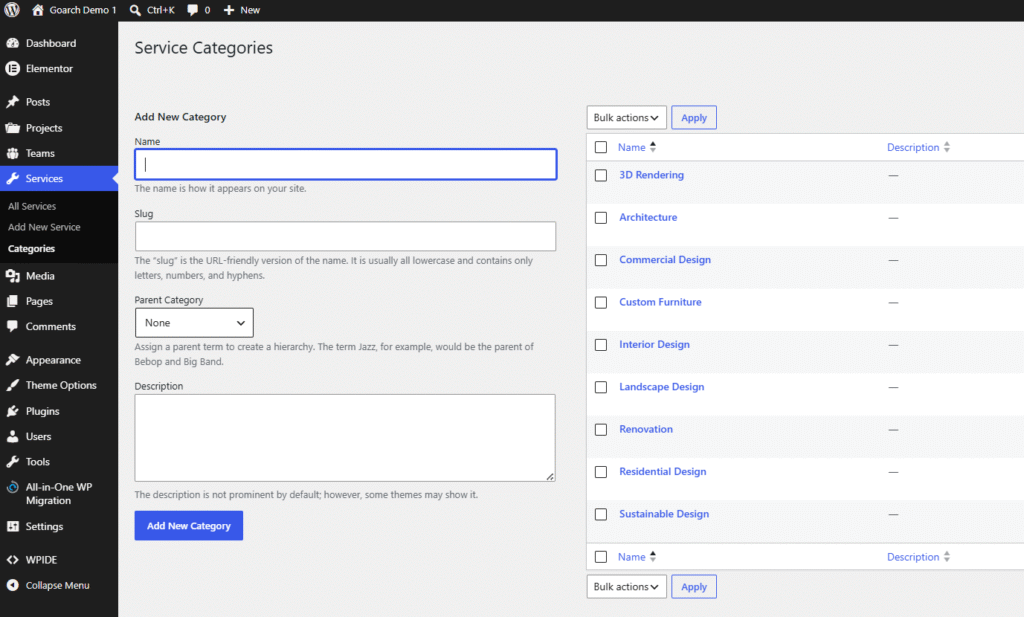
- Name: Enter the clear, front-end visual category label (e.g., Sustainable Design or Custom Furniture).
- Slug: Specify the URL-friendly lowercase path handle used to safely link to explicit category filter archives.
- Parent Category: Set up hierarchical relationships to nest specialized sub-services beneath broader core design categories.
- Description: Add informational notes to summarize the category’s scope; specific theme templates may pull this data to form intro sections on category pages.
Tips & Best Practices
- Use Proper FontAwesome Class Syntax: When populating the Icon Class (FontAwesome, etc.) metadata field, verify that you include the complete CSS class syntax required by your integrated library version (e.g.,
fas fa-pencil-ruler). Adding only the base identifier name likepencil-rulerwithout its structural prefixes will cause the graphic asset to render as an empty box or break entirely on the frontend. - Strictly Adhere to Single-Line Features: The layout engine reads the Key Features (one per line) text block line by line to build front-end checklists. Do not input paragraph text blocks or use manually typed formatting characters like asterisks or dashes. Simply type your points as plain text strings and separate each deliverable with a standard line break.
- Keep Price Units Uniform: To ensure multi-column pricing blocks and directory grids look cohesive, adopt a consistent terminology strategy for your Price Unit inputs (e.g., sticking strictly to lowercase
fixedor/hracross all entries). Mixing formats can disrupt layout symmetry on comparison matrices.
Troubleshooting
Dynamic icon assets do not render or display as empty squares on the live page
This indicator points to a syntax error or a missing icon font asset. Open the service entry from your main dashboard tracking index, navigate down into the Service Details parameters block, and confirm the text string in the Icon Class box accurately matches active FontAwesome definitions. Also ensure your active global theme settings or Elementor configuration panels have third-party icon support toggled to active.
Key features appear as a single cramped text block instead of a structured list
This formatting error happens when text strings are entered continuously without proper line breaks. Open your Service Details panel, go to the Key Features (one per line) text block, and verify that each item sits on its own individual line rather than running together as continuous sentences. Use standard line breaks (Enter) between features to fix the list format.