
How Can We Help?
GoArch Icon Box
The Goarch Icon Box widget is a clean, multi-purpose Elementor element designed to display services, core values, features, or company statistics in an organized grid layout. By blending graphical icons, structured typography headings, and call-to-action links into cohesive content blocks, it helps you present key selling points effectively on corporate, architecture, and real estate websites.
Feature Overview
- Repeater-Based Content Management: Add, clone, and arrange multiple icon boxes within a single widget wrapper.
- Flexible Column Grids: Display your features in multi-column layouts to balance horizontal and vertical whitespace.
- Pre-Built Style Frameworks: Toggle between alternative presentation variants to quickly alter design aesthetics.
- Complete Box & Graphic Styling: Refine everything from icon sizing and coloring to the underlying background fill, borders, and hover shadows.
Step-by-Step Instructions
Follow these steps to deploy and configure a Goarch Icon Box grid:
- Open your target layout within the active Elementor page builder canvas.
- Search for Goarch Icon Box using the left-hand elements query panel.
- Drag the widget item and drop it directly into a section row or container column.
- Populated your features, text fields, and custom navigation destination links under the Content tab.
- Navigate to the Style tab to fine-tune graphics scaling, bounding boxes, background properties, and padding depths.
Explanation of Settings
Content Tab
The Content tab enables you to structure individual feature items and determine the overarching responsive grid layout.
Icon Boxes
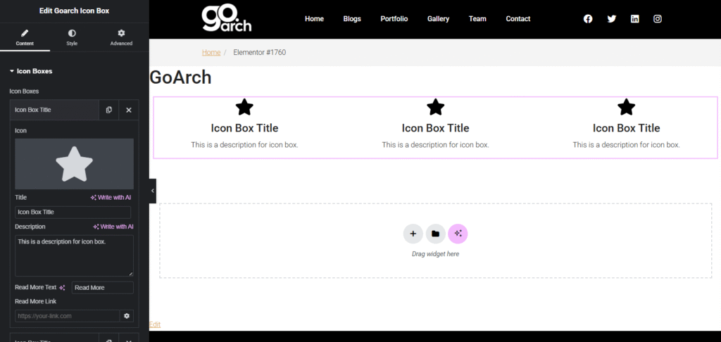
- Icon Boxes Repeater List: View, reorder, clone, or delete individual box elements. Click + Add Item to append a new card to the list.
- Icon: Choose a modern vector layout or select a graphic from your library (e.g., a star icon) to serve as the visual anchor for the individual box.
- Title: Input the primary heading text for the item block (e.g.,
Icon Box Title). - Description: Enter the multi-line contextual copy block that outlines the core details of the feature.
- Read More Text: Define the call-to-action text label that prompts users to interact (e.g.,
Read More). - Read More Link: Enter the destination URL or dynamic link path (e.g.,
[https://your-link.com](https://your-link.com)) where visitors will be routed upon clicking the item.
Layout Settings
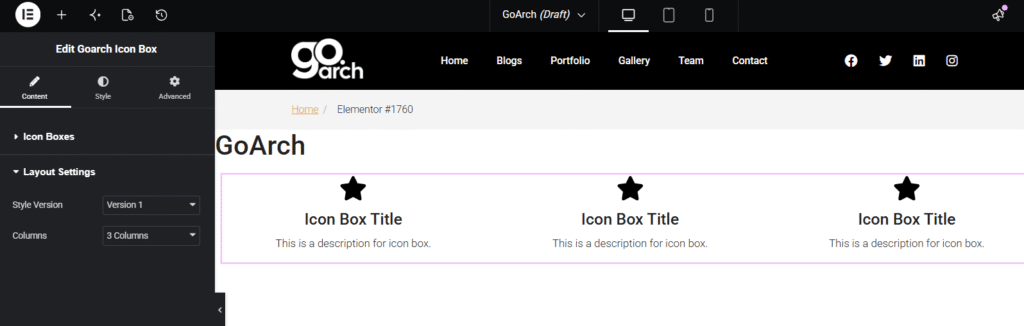
- Style Version: Choose from a dropdown of pre-configured design variants (e.g., Version 1) to alter how content alignments and text assets stack.
- Columns: Control the horizontal distribution of your items across a grid row by selecting a preset count (e.g., 3 Columns).
Style Tab
The Style tab controls the fine-grain presentation dimensions of the graphic and containing block elements.
Box Style
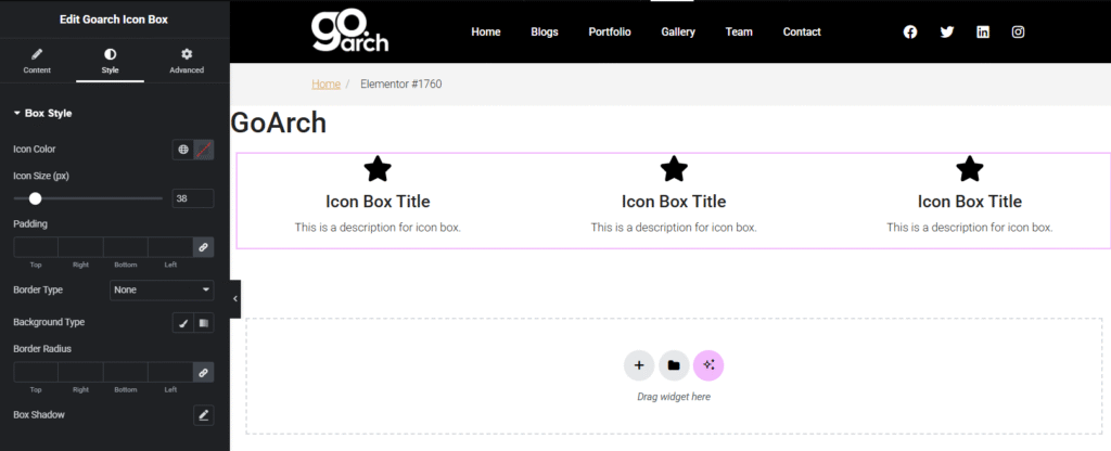
- Icon Color: Assign localized branding color choices or uniform global swatches to colorize the primary vector icon asset.
- Icon Size (px): Slide or enter a precise pixel dimension value (e.g.,
38) to increase or decrease the visual scale of the icon graphics. - Padding: Establish precise internal breathing spaces between the card boundaries and the inner content layers using uniform or unlinked pixel (
px) coordinates. - Border Type: Select an outer perimeter stroke style for the boxes (None, Solid, Double, etc.) to separate them visually from adjacent canvas areas.
- Background Type: Apply a solid, simple Classic color fill, background image backdrop, or clean Gradient transitions behind the individual box elements.
- Border Radius: Link or unlink pixel coordinates to smooth out or round the corner sharp angles of your background boxes.
- Box Shadow: Open the localized shadow generator tool to append drop or inner structural shadows that add elevation and depth to the cards.
Advanced Tab
The Advanced Tab gives you access to Elementor’s native structural layouts. Use these settings to assign custom container margins, trigger scroll-driven entry motion animations, manipulate layout z-index priorities, append targeted custom CSS classes, or apply responsive visibility rules to selectively display your feature grids across desktop, tablet, or smartphone viewports.
Tips & Best Practices
- Maintain Visual Symmetry: To ensure your grids stay balanced and neat, try to keep your titles and descriptive text roughly the same length across all icon boxes. If one card has three lines of text and another has ten, the row heights will look uneven.
- Highlight Actions with Clean Hover States: If you choose a solid background style under the Box Style accordion, consider configuring a subtle hover box shadow or a slight background color swap. This gives users immediate, satisfying visual feedback when their cursor moves over clickable sections.
- Use Relevant Vectors: Match your icons directly to the core theme of your content. For example, use architectural symbols for design features or gear graphics for technical solutions to make the layout more intuitive and scannable.
Troubleshooting
Icon boxes are stacking vertically instead of forming a grid
First, expand the Layout Settings menu under the Content tab and make sure your Columns dropdown is explicitly set to your target count (such as 3 Columns instead of 1 Column). If the settings are correct but they still wrap vertically, ensure that the containing Elementor section or parent inner section column width is not constrained too tightly.
The Read More button is completely missing from the card display
The CTA link label will only render on the front end if text is present in the configuration. Check the Icon Boxes repeater item detail block and make sure you have explicitly filled out the Read More Text field. Leaving this blank can act as a toggle to hide the action text.