
How Can We Help?
GoArch Blog Posts
The Goarch Blog Posts widget is an advanced dynamic element designed specifically for the Elementor page builder. It enables architects, designers, and web developers to create clean, modular blog grids and magazine-style content feeds that sync flawlessly with WordPress posts. Offering multiple layout models, built-in date badges, metadata visibility toggles, and granular spacing controls, this widget serves as the perfect solution for styling post archives, news updates, and media publication tracks.
Feature Overview
- Multi-Layout Flexibility: Switch between pre-engineered presentation templates (
Demo 1,Demo 2,Demo 3) to seamlessly change how media cards and content elements fit together. - Smart Meta Management: Complete administrative control over individual elements, including categories, metadata fields, custom reading-time indicators, and specialized date badges.
- Dedicated Layout-Specific Controls: Access targeted style blocks constructed specifically to refine background fills, border elements, typography stacks, and link states based on the active layout.
- Precise Grid Matrices: Easily alter post allocations, adjust column widths, configure item gaps, and set up content boundary paddings to fit narrow or ultra-wide viewports.
Step-by-Step Instructions
Follow these layout actions to embed and configure a Goarch Blog Posts feed on your page:
- Open your target post archive or custom page template using the active Elementor editor panel.
- Navigate to the widget search box on the left, type Goarch Blog Posts, and drag the block cleanly into an active section framework.
- Access the Content tab to lock in your master grid architecture: select your theme layout type, specify the post capacity parameters, choose column arrangements, and manage component flags.
- Open the Style tab to fine-tune your global color palettes, typography styling rules, text margins, and boundary pad profiles.
- If using a multi-column or customized display style, click open the dedicated sub-panel (such as Demo 3 Style) to customize layout-exclusive options like date badge elements and horizontal gap sliders.
- Save your template modifications and select Update to publish the dynamic post loop to your live site environment.
Explanation of Settings
Content Tab
The Content tab routes database post filters, handles column architecture, and toggles visual structural flags.
Content Panel
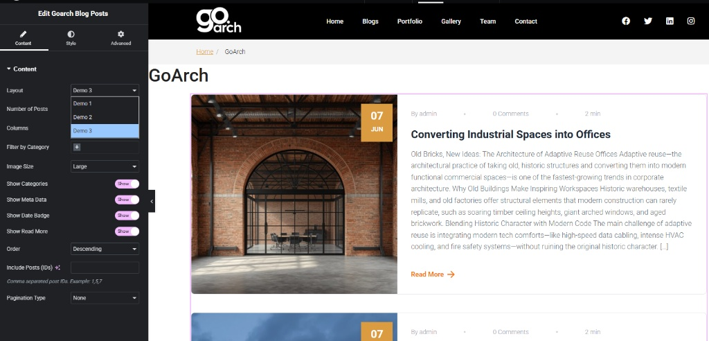
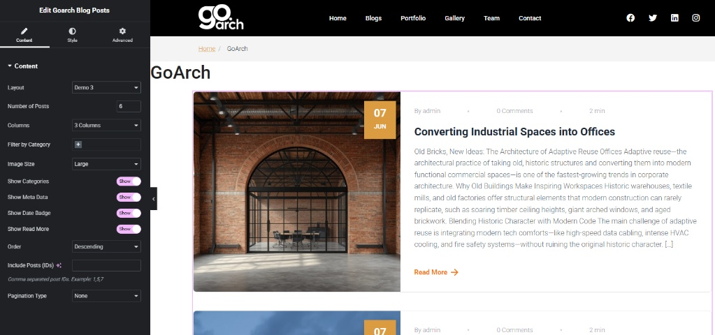
- Layout: Use this primary selector to alternate between predefined structural design archetypes. As illustrated in
image_cf689b.jpg, you can choose between Demo 1, Demo 2, or Demo 3 (set to Demo 3). - Number of Posts: Enter the max ceiling threshold of dynamic items displayed inside the section matrix. In
image_cf68bf.jpg, this value is defined at 6. - Columns: Control structural distribution widths by selecting a predefined column allocation format (set to 3 Columns in
image_cf68bf.jpg). - Filter by Category: Tap the selection field selector (
+icon) to narrow the scope of the dynamic loop to explicit post categories or tag definitions. - Image Size: Set the media asset quality scale to preserve bandwidth or maximize presentation crispness (set to Large across both
image_cf689b.jpgandimage_cf68bf.jpg). - Show Categories / Show Meta Data / Show Date Badge / Show Read More: Operational master toggle switches. Flip these to Show to display tags, reading timelines, author metrics, custom overlay date badges, and text navigation targets automatically.
- Order: Sort structural post streams using descending (
Descending) or ascending timelines based on publication records. - Include Posts (IDs): Input target comma-delimited asset ID strings (e.g., 1, 5, 7) to prioritize specific sticky posts above global automated archive collections.
- Pagination Type: Set up pagination layers below the grid stream (configured to None in the provided screenshots).
Style Tab
The Style tab features stacked design configuration drawers to balance spacing profiles, manage text colors, and configure link hover behavior across your content loops.
Style Panel
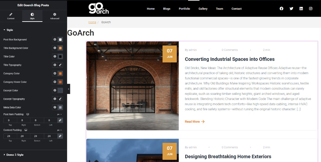
- Post Box Background / Title Background Color: Establish color rules behind individual card elements or title rows.
- Title Color / Title Typography: Control header styles, font scaling tracks, and alignment weights.
- Category Color / Category Hover Color: Customize tag states to make categorized navigation distinct and visually intuitive.
- Excerpt Color / Excerpt Typography: Format description layout snippets to ensure proper contrast and modern structural spacing.
- Meta Data Color: Set neutral palettes for text elements like author tags, comment counts, and reading timelines.
- Post Item Padding: Set the outmost framework padding surrounding each structural box block (configured symmetrically to 0px in
image_cf68f5.jpg). - Content Padding: Control inner breathing room surrounding the layout text segment block. In
image_cf68f5.jpg, this is assigned an even distribution value of 24px (Top, Right, Bottom, Left).
Demo 3 Style Panel
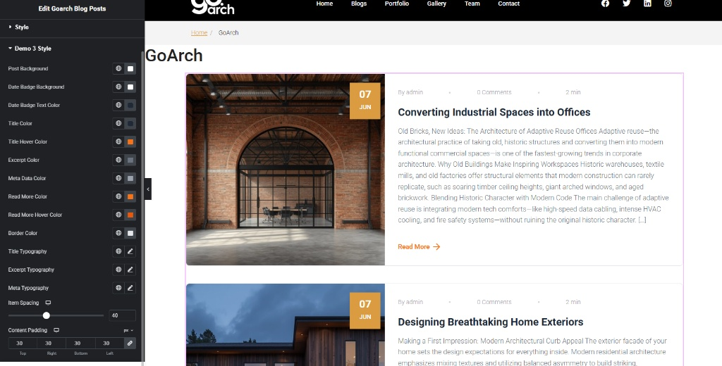
This section updates dynamically to provide specialized parameters customized exclusively to the active theme model selection (Demo 3).
- Post Background: Apply custom container background color treatments unique to this configuration profile.
- Date Badge Background / Date Badge Text Color: Customize the prominent block date flag (visible as the golden block stamp “07 JUN” in the image previews).
- Title Color / Title Hover Color: Toggle dedicated link color transitions when visitors interact with post titles.
- Excerpt Color / Meta Data Color: Override global description text fills for this specific layout framework.
- Read More Color / Read More Hover Color: Customize the call-to-action anchor text and arrow icon colors for interactive states.
- Border Color / Title Typography / Excerpt Typography / Meta Typography: Manage specific element outlines and precise typography properties to lock in your design system’s aesthetic.
- Item Spacing: Calibrate horizontal and vertical element gaps between stacked content elements. In
image_cf6bbd.jpg, this slider track value is precisely set to 40. - Content Padding: Apply secondary padding rules to content containers. As shown in
image_cf6bbd.jpg, this property is customized symmetrically to 30px across all margins.
Tips & Best Practices
- Coordinate Columns with Post Counts: Ensure your grid doesn’t break awkwardly across desktop layouts. When using a 3 Columns configuration wrapper matching a 6 post ceiling count (
image_cf68bf.jpg), your grid will divide into two balanced rows of three items each. If your post count limit changes to 5, the second row will look incomplete, leaving an empty grid slot on the right. - Balance Content Padding Tracks: Pay close attention to nested spacing variables. Combining a master Content Padding configuration of 24px (
image_cf68f5.jpg) with an inner layout override padding value of 30px (image_cf6bbd.jpg) impacts text block alignment next to featured assets. Always preview the design across mobile views to ensure text components don’t become overly narrow or cramped. - Leverage the Date Badge Effect: The layout features a structured block date indicator overlaying your featured media assets (
image_cf689b.jpg). To make sure this badge stands out clearly, use a contrasting Date Badge Background shade relative to your standard blog graphics, and verify that Show Date Badge remains toggled to Show in your core Content settings panel.
Troubleshooting
The layout displays a blank grid container or misses new articles
Review your category configurations and database parameters. Check your Content Tab -> Filter by Category selector field (image_cf68bf.jpg). If you select a specific category tag that contains zero published articles or assign post IDs under Include Posts (IDs) that do not exist, the template loop will output an empty container block on the frontend.
“Read More” link buttons overlap adjacent excerpt blocks
This issue usually points to compressed internal margins or unbalanced word distributions. Open the Style Tab -> Demo 3 Style Panel (image_cf6bbd.jpg) and slide the Item Spacing adjustment control up (configured at 40 in the guide model). Increasing this value separates the title text, summary paragraphs, and action links, preventing elements from overlapping.