
How Can We Help?
GoArch Custom Slider
The Goarch Custom Slider widget is a premium, robust Elementor element designed to build immersive, high-impact background slideshows for architecture, engineering, and interior design websites. It combines striking background image transitions with independent text layers (Title, Subtitle, and Description) and call-to-action buttons, giving you full command over your site’s hero sections and presentation showcases.
Feature Overview
- Advanced Slide Management: Stack multiple slides with custom graphic backdrops, heading structures, and targeted action buttons.
- Granular Typography & Spacing Layouts: Style and position every text layer independently with custom margins, colors, and font scales.
- Custom Navigation & Pagination Aesthetics: Move beyond basic sliders with pixel-precise adjustments for directional navigation buttons and pagination dots.
- Smart Autoplay Engine: Fine-tune transition animations and automated looping speeds to optimize the user browsing experience.
Step-by-Step Instructions
Follow these clear structural steps to deploy a Goarch Custom Slider module:
- Launch your layout workspace using the active Elementor page builder panel.
- Search for Goarch Custom Slider in the left-hand elements menu.
- Drag the widget item and drop it cleanly into a full-width section row or container column.
- Input your image slides, descriptive text, and button hyperlinks under the Content tab.
- Move systematically through the Style tab submenus to refine visual layouts, hover parameters, alignment positioning, and navigational spacing.
Explanation of Settings
Content Tab
The Content tab enables you to add slide items, set general slider dimensions, configure global playback rules, and supply alternative navigation icons.
Slides
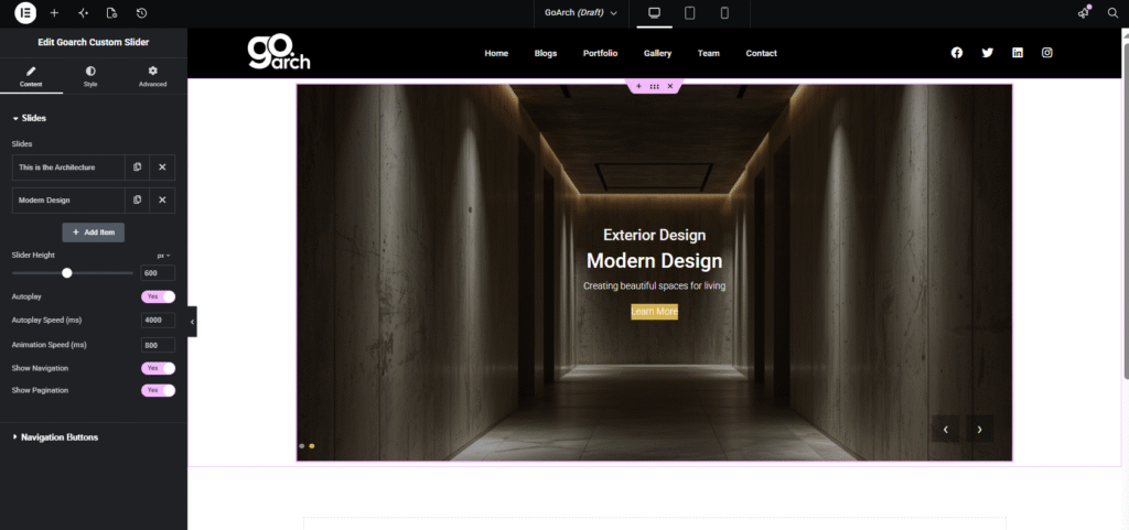
- Slides List: View, reorder, clone, or delete individual slide layers. Click + Add Item to introduce a new slide to the stack.
- Slider Height: Drag the horizontal slider or type a value (e.g.,
800) to define the exact vertical footprint of your slider in pixels (px) or alternative units. - Autoplay: Toggle to Yes to enable automated slide cycling, or No to require manual interaction.
- Autoplay Speed (ms): Input the duration each slide stays static on screen before moving to the next item (e.g.,
4000milliseconds equals 4 seconds). - Animation Speed (ms): Define the execution speed of the slide transition effect itself (e.g.,
800ms). - Show Navigation / Show Pagination: Toggle the visibility of global navigation directional buttons or pagination index indicators.
Navigation Buttons
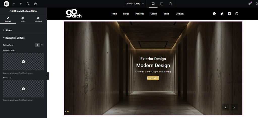
- Button Type / Icon Configurations: Upload custom SVG icons or select shapes from your library to override the default sliding navigation arrows. Leave these empty to fallback to standard system arrows.
Style Tab
The Style tab houses extensive micro-controls to govern the layout alignment, text presentation tiers, and interactive elements.
Slide Content
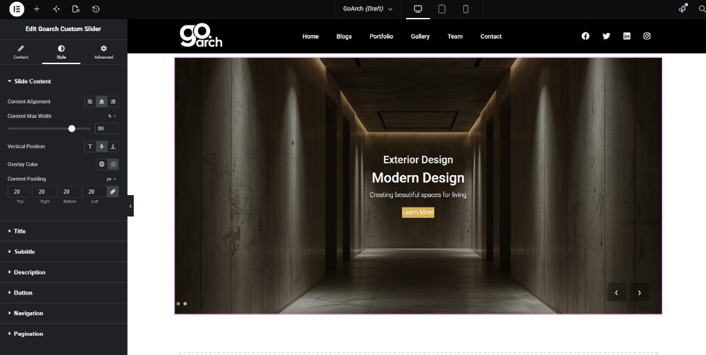
- Content Alignment: Simultaneously align all layout text blocks to the Left, Center, or Right.
- Content Max Width: Restrict how far your text strings stretch horizontally across the slider area by setting a maximum percentage constraint (e.g.,
80%). - Vertical Position: Push your text overlay groupings to the Top, Center, or Bottom zones of the active slide.
- Overlay Color: Introduce a classic solid color fill or transparent tint directly on top of your background slide image to optimize legibility.
- Content Padding: Establish structural internal breathing gaps uniformly or independently across the Top, Right, Bottom, and Left parameters.
Title
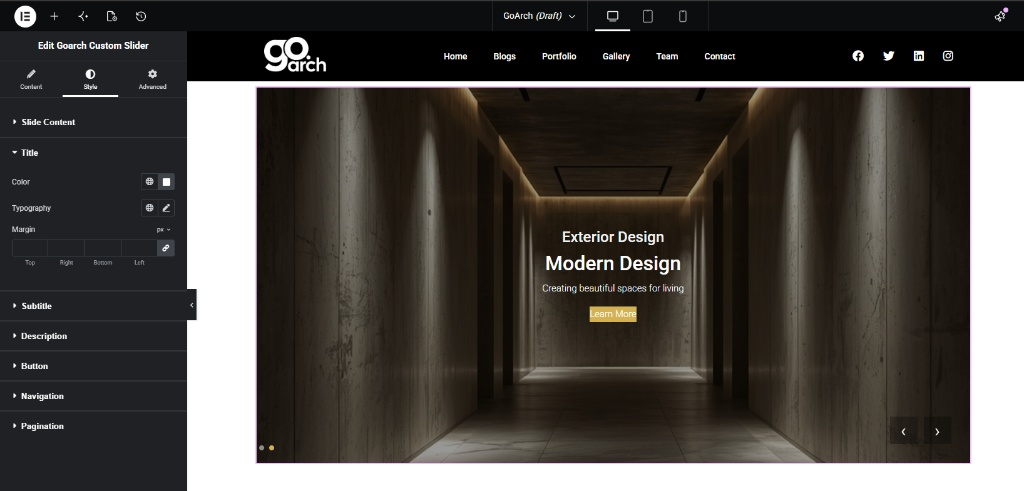
- Color & Typography: Assign unique system branding swatches or custom hex values, and edit absolute font parameters (font family, weight scale, and transformations) for your primary headings.
- Margin: Configure unlinked outer margins to create breathing room between the slide header and surrounding text items.
Subtitle
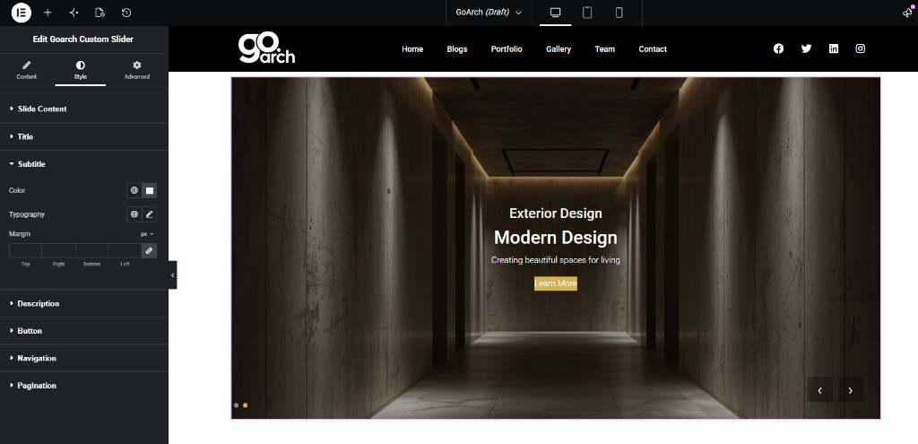
- Color, Typography, & Margin: Fine-tune the standalone presentation metrics of your secondary subtitle element layer to ensure clean visual reading patterns.
Description
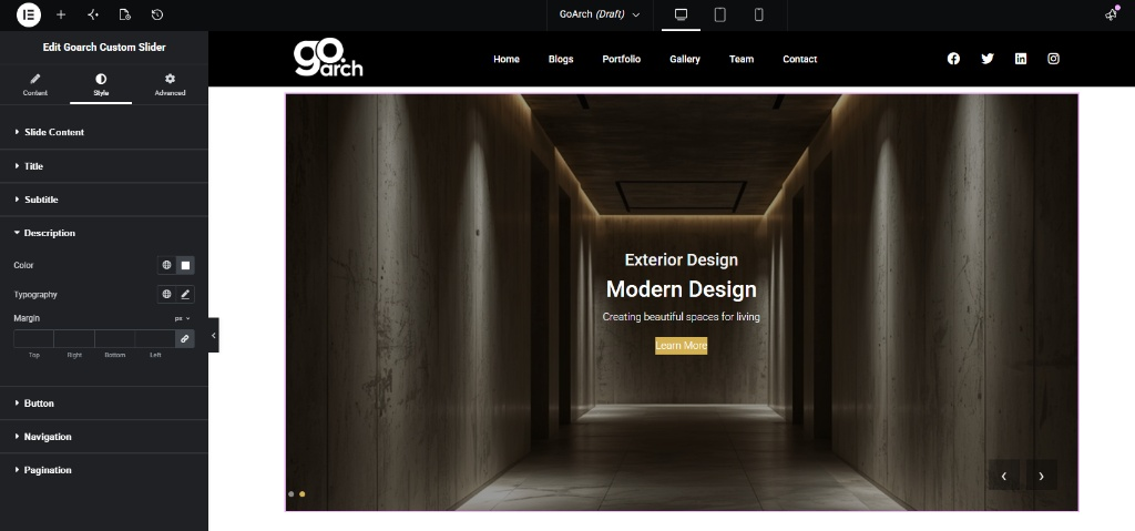
- Color, Typography, & Margin: Format the long-form multi-line description copy block parameters to separate it visually from titles and action buttons.
Button
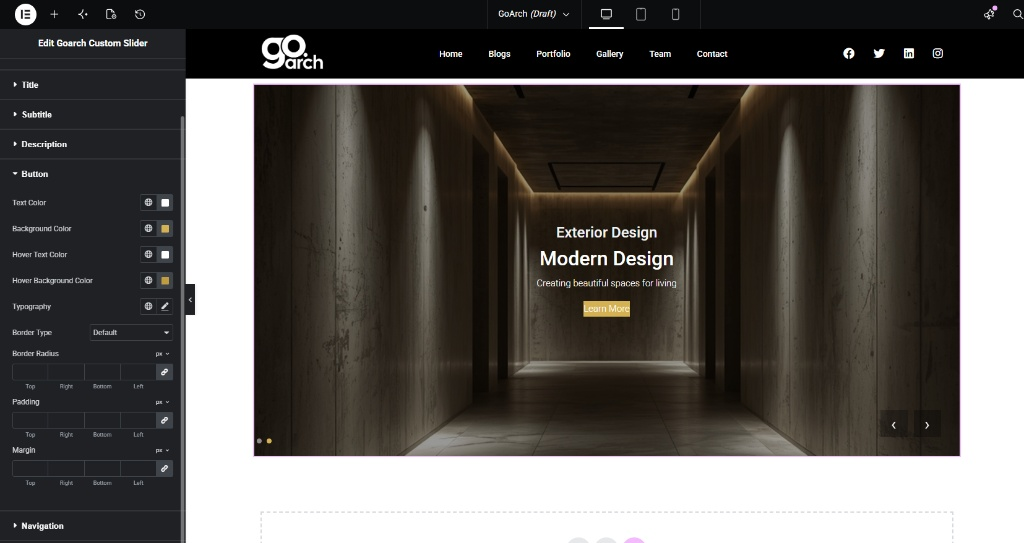
- Text & Background Color: Define clear contrast color values for the action link box across both normal state displays and interactive mouse-hover overrides.
- Typography & Border Type: Select button font scaling values and apply optional structural borders (Solid, Double, Dotted) along with customized Border Radius roundings.
- Padding & Margin: Control the padding fields inside the button bounding box, alongside external margins to refine its structural layout context.
Navigation
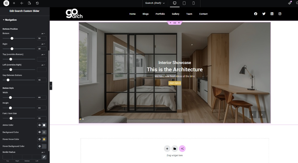
- Buttons Position: Precisely offset your interactive navigation arrows from the layout edges using the Bottom, Right, Top, and Left sliders (measured in pixels).
- Gap Between Buttons: Adjust the relative physical space separating the Previous and Next action controls (e.g.,
10). - Button Style Dimensions: Define the Width and Height bounds of the navigation icon frames, alongside localized Font / Icon Size scaling.
- Colors & Border Radius: Apply distinct background fills and arrow icon tints for default state displays and hover actions.
Pagination
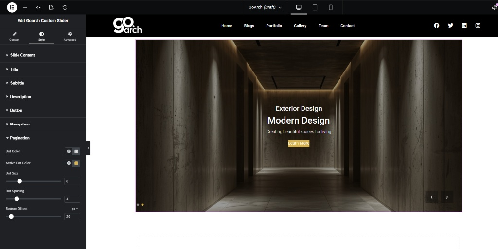
- Dot Color / Active Dot Color: Choose distinct coloring options for resting pagination indicators versus the highlighted dot representing the current active view.
- Dot Size & Spacing: Adjust the physical layout scale of the individual tracking dots and configure horizontal gaps to distribute them cleanly.
- Bottom Offset: Define the exact vertical pixel clearance to lift the pagination dot row up from the bottom boundary line of your slider container.
Advanced Tab
The Advanced Tab includes core, global Elementor engine layout behaviors. Use this section if your presentation layout calls for intricate container margin offsets, custom entrance motion animations, z-index sorting layers, targeted custom CSS tracking IDs/Classes, or responsive breakpoint configurations to selectively hide your main showcase slider on mobile hardware profiles.
Tips & Best Practices
- Optimize Image Weight: Large, uncompressed presentation photographs can significantly drag down page speed. Always scale and compress your images to modern web formats (such as WebP) before linking them inside your slider items.
- Ensure Contrast Longevity: If your slider showcases varying slide backgrounds—such as switching between bright concrete spaces and dark timber textures—apply a global semi-transparent dark backdrop mask inside the Slide Content → Overlay Color settings. This guarantees that white typography layers remain legible across all transitions.
- Design for Mobile viewports: A slider height of
800pxlooks stunning on desktop but may force users to scroll excessively on mobile. Use the device view icons alongside the Slider Height settings to scale down vertical dimensions for smartphones.
Troubleshooting
Slide transition animations are skipping or feel sluggish
This typically points to an excessively fast setting match or oversized source imagery. Ensure that your Autoplay Speed parameter provides enough clearance relative to your Animation Speed threshold (e.g., a 4000ms delay vs an 800ms animation transition).
My navigation arrows are completely invisible on screen
Check the Navigation configuration panel within the Style tab. If you applied a dark background fill or left your text overlay bounding parameters unaligned, your arrow positions might be hidden behind nearby sections or color boxes. Use the Buttons Position coordinates to pull them cleanly into open view.