
How Can We Help?
GoArch Testimonials V2
The Goarch Testimonials V2 widget is a visually striking Elementor element designed to showcase high-impact client reviews, user experiences, and professional feedback. Unlike traditional text-heavy layouts, Version 2 emphasizes large-format portrait imagery paired with clean typography blocks beneath the asset wrapper. This design is highly effective for injecting authentic human connection, building customer confidence, and establishing social proof on premium architecture and real estate landing pages.
Feature Overview
- Image-Centric Card Architecture: Places prominent client portrait photography at the forefront of each feedback card.
- Flexible Grid Control: Effortlessly configure multiple column widths to adapt reviews neatly into full-width grids or compact section blocks.
- Smart Ordering & Constraints: Control your display loop using built-in query sorting filters and structural layout caps.
- Independent Typography Styler: Fine-tune the precise color swatches, font scales, and line heights for client names, roles, and review statement strings.
Step-by-Step Instructions
Follow these clear configuration steps to integrate a Goarch Testimonials V2 block:
- Launch your target page layout inside the active Elementor editor canvas.
- Search for Goarch Testimonials V2 via the left-hand widget search field.
- Drag the element and drop it directly into your preferred section container row.
- Populate individual client quotes, upload high-resolution profile imagery, and assign corporate titles under the Content tab.
- Head over to the Style tab to systematically match text alignments, color paints, and font families with your local brand styling.
Explanation of Settings
Content Tab
The Content tab provides structural options to coordinate individual feedback assets, adjust horizontal column grids, and control query loops.
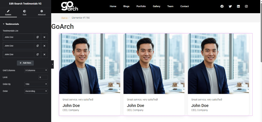
- Testimonials List: The primary repeater system to manage customer cards. Click any item block (e.g., John Doe) to reveal its data controls, or click + Add Item to append a new card. Inside each card, you can configure:
- Image/Avatar: Upload a large, portrait-oriented customer photo that serves as the card’s visual anchor.
- Description: Enter the core review text block (e.g.,
Great service, very satisfied!). - Title: Input the individual’s primary name string (e.g.,
John Doe). - Subtitle: Specify their company, job title, or location credentials (e.g.,
CEO, Company).
- Grid Columns: Choose how many review cards are distributed horizontally across a single row container (e.g., 3 Columns).
- Limit: Enter a numeric value (e.g.,
6) to set the maximum threshold of cards fetched into the active layout framework. - Order By: Choose the organizing rule for the testimonial display sequence from the dropdown list (e.g., Title, ID, or Date).
- Order: Pair with your sorting rule to render elements in either Ascending or Descending sequence loops.
Style Tab
The Style tab features specialized typography controls to curate a polished, readable text block underneath the featured image frames.
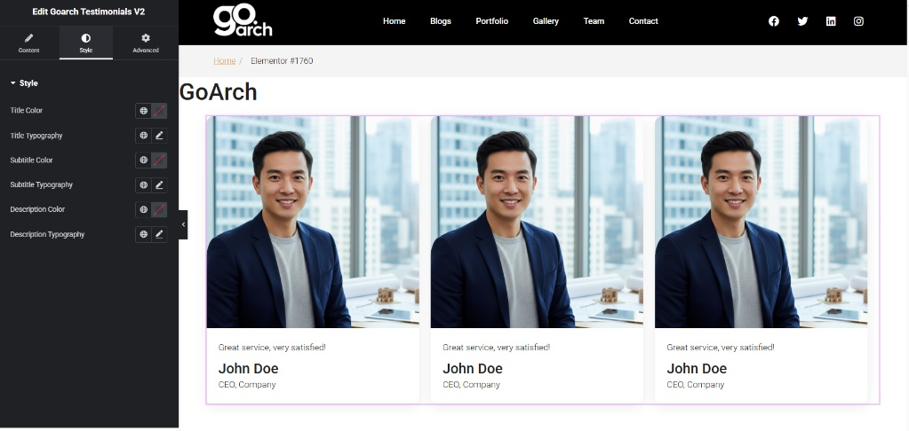
- Title Color & Typography: Edit the font family, font thickness weights, transformations, and custom color swatches applied to the client’s primary name text string.
- Subtitle Color & Typography: Manage localized color properties and font scaling specifications for the secondary company or position line entry.
- Description Color & Typography: Direct the precise visual color, line height spacing, and style sizes for the primary testimonial quotation paragraph block.
Advanced Tab
The Advanced Tab exposes Elementor’s native parent layout layout settings. Use these panels if your layout requires specific external container margin adjustments, scroll-driven entrance motion animations, layout z-index layer stack values, targeted custom CSS class attributes, or responsive rules to selectively hide or display the reviews block across desktop, tablet, or smartphone devices.
Tips & Best Practices
- Use Uniform Image Aspect Ratios: Because the image frame occupies the entire upper portion of the card layout, ensure all your uploaded customer photos share matching crop ratios. Mixing tall vertical portraits with wide horizontal photos will cause uneven row heights across your grid rows.
- Keep Descriptions Concise: To maintain pristine horizontal visual symmetry, aim for succinct, high-impact quotes. Keeping reviews roughly identical in length prevents text elements from wrapping unevenly across adjacent columns.
- Optimize Image Weight: Since this widget showcases large client photos side-by-side, always compress your images before uploading them to WordPress. Using lightweight web formats keeps your page loading times fast without sacrificing visual crispness.
Troubleshooting
Some of my review cards are being cut off or missing entirely
Check the numeric parameter set within the Limit field under the Content tab. If this option is set to a lower number than the total number of items built into your Testimonials List repeater pool, the widget will truncate your list and hide any extra entries that exceed that number.
The review text colors are blending into the page background
If your text layers are washing out or hard to read, navigate to the Style tab and review your configuration choices for Title Color, Subtitle Color, and Description Color. Assign highly contrasting hex values or global theme swatches that pop clearly against your section’s background canvas.