
How Can We Help?
GoArch Services
The Goarch Services widget is an elegant, multi-functional Elementor element crafted specifically to showcase your core professional solutions, design phases, or consulting capabilities. Perfect for architecture firms and creative studios, this widget allows you to create high-impact informational blocks featuring comprehensive service titles, detailed descriptions, responsive tag clouds, and call-to-action (CTA) triggers paired alongside beautiful project graphics.
Feature Overview
- Preset Layout Demonstrations: Instantly toggle between pre-designed global structural layouts (Demo 1, Demo 2, and Demo 3) to adjust content positioning across your sections.
- Inline Taxonomy Badges: Effortlessly break down complex service categories with built-in comma-separated metadata tag clouds.
- Granular Item-by-Item Data Architecture: Control distinct headings, rich-text bio descriptions, imagery, and hyperlink routing for each independent service container.
- Simplified Global Typography Styler: Fine-tune structural font families, color swatches, and overlay button surfaces directly inside a unified design workspace.
Step-by-Step Instructions
Follow these clear structural steps to deploy and adjust a Goarch Services array:
- Launch your target page layout template from within the active Elementor editor canvas interface.
- Use the left-hand elements menu index to search for Goarch Services.
- Drag the widget block and drop it smoothly into an open section or full-width column container.
- Open the Demo Settings block under the Content tab to lock down your preferred core layout configuration.
- Expand the Service Items repeater container to populate your company’s capabilities, description copy, metadata tags, and images.
- Pivot to the Style tab to systematically align header fonts, text colors, and background button accents with your global branding.
Explanation of Settings
Content Tab
The Content tab manages your structural layouts, global section names, and individual service information blocks.
Demo Settings Panel
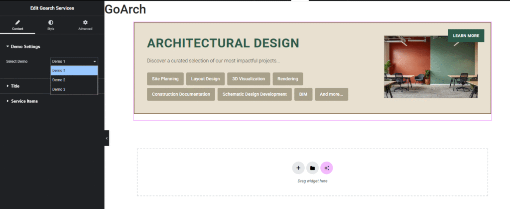
- Select Demo: Use this primary dropdown selector menu to switch between the layout templates included in the theme asset package. Choosing an option (e.g., Demo 1, as shown in
image_e06ec7.png) instantly updates the layout view into a cinematic full-width banner card profile split neatly between informational text metrics and a floating contextual graphic component.
Title Panel
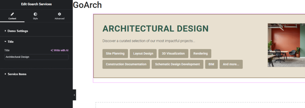
- Title: Input a global structural section name or headline string (e.g.,
Architectural Design) inside this input block to establish the overarching theme for this services sequence.
Service Items Panel
This dynamic list builder allows you to manage the individual service cards that cycle through the frontend layout loop.
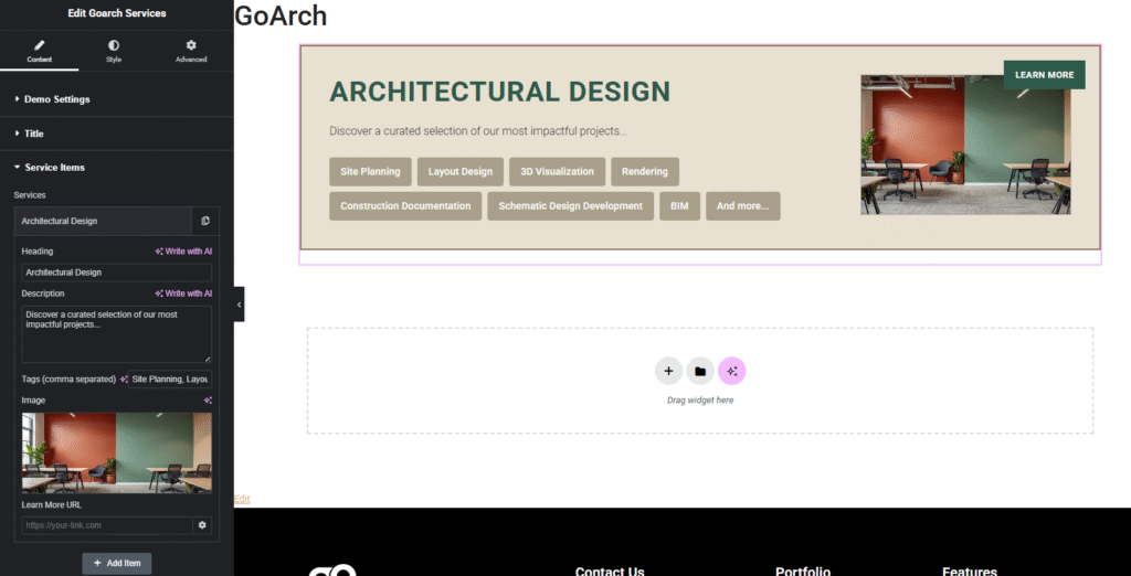
- Services Repeater Organizer: Click an existing layout block title row to expand its core parameters, tap the duplicate icon to quickly copy an entire service profile, or use the + Add Item button to add a blank capability node to the list.
- Heading: Define the primary focus title string of this specific service item card (e.g.,
Architectural Design). - Description: A text window used to write short promotional copy, project lists, or detailed methodology outlines explaining what the service involves.
- Tags (comma separated): A smart metadata field designed to generate secondary tag pill clouds automatically. Enter individual keywords separated by commas (e.g.,
Site Planning, Layout Design, 3D Visualization, Rendering) to turn them into structured layout badges underneath your description copy. - Image: Click the image upload placeholder box to choose or upload a representative project snapshot or interior render file directly from your local WordPress Media Library.
- Learn More URL: Input an external page destination address or target page anchor slug (e.g.,
[https://your-link.com](https://your-link.com)) to connect the inline LEARN MORE button anchor directly to full-length documentation pages or contact sheets.
Style Tab
The Style tab features specialized design dials to manage the colorways and typography of your typography elements.
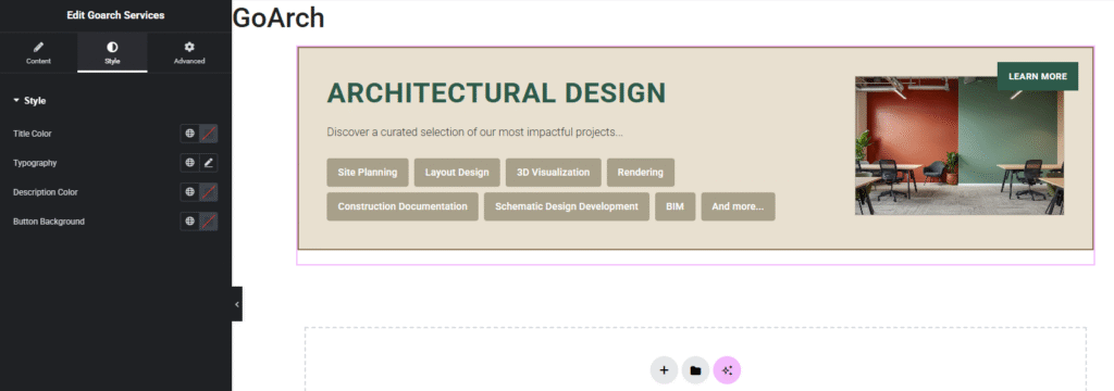
Style Panel
- Title Color: Modify the color palette assignment or choose global theme hex swatches to update the main service item heading text strings.
- Typography: Click the pencil edit tool icon to adjust font family selections, scaling dimensions (
px,em, orrem), font-weight metrics, line heights, and letter-spacing options. - Description Color: Change the color palette values applied directly to the primary rich-text description summary blocks.
- Button Background: Define a solid or semi-transparent background color layer block to adjust the appearance of the floating overlay action buttons (e.g., the LEARN MORE link blocks).
Advanced Tab
The Advanced Tab includes standard layout rules built directly into the core Elementor framework. Use this panel to adjust external section margins and internal column paddings, assign scroll-triggered entrance motion animations, declare precise layout layer z-index priorities, configure custom developer CSS class anchors, or toggle responsive visibility rules to selectively hide or show your service matrices across desktop screens, tablet viewports, or mobile screens.
Tips & Best Practices
- Format Badges with Commas: The badge pill cloud relies entirely on standard comma placement within the Tags (comma separated) entry box. Avoid using bullet points or line breaks inside this text entry field; simply separate each term with a comma, and the widget will handle the layout spacing and styling automatically.
- Maintain Visual Image Continuity: As highlighted across the live workspace preview window, the featured image component anchors itself tightly against the text blocks. For clean horizontal alignments, crop your service preview snapshots to matching widescreen landscape dimensions (such as a standard 16:9 aspect ratio) before adding them to your media library.
- Match Button Contrast to Graphics: Because the layout blocks place the LEARN MORE button overlay directly over the top corner of your featured service image asset, always use a highly contrasting color swatch inside the Button Background style field. This guarantees that your text elements remain completely readable, even when displaying bright or busy image assets underneath the text layer.
Troubleshooting
The layout badges or comma-separated tags look bunched up or display as a single long sentence
Review your inputs within the Tags (comma separated) field container under the Service Items repeater list shown in image_e0c599.png. Ensure you have placed an actual comma mark between every standalone phrase element. If commas are omitted, the code cannot split the text blocks into separate layout components and will render the text as a single unformatted sentence string.
The CTA button link is non-responsive or fails to route visitors to my landing pages
Open your active item row inside the Service Items repeater container and verify that the Learn More URL field is populated with a valid link structure. Ensure it includes the absolute URL prefix rules (such as https://), as typing in shortened paths without the full domain structure can cause broken redirects or trigger 404 page errors for your site visitors.