
How Can We Help?
GoArch Vertical Menu
The Goarch Vertical Menu widget is an elegant, highly structured navigation element engineered for the Elementor page builder. Ideal for building stylized custom sidebars, expansive footer navigation grids, full-screen overlay layouts, or dedicated dashboard menus, this element hooks directly into the native WordPress menu ecosystem. It transforms standard link structures into a beautifully formatted vertical index featuring customizable micro-interactions, custom status borders, and isolated sub-menu control structures.
Feature Overview
- Native Core Integration: Instantly query and generate any existing structural menu schema configured inside your WordPress dashboard.
- Granular Item Metrics: Apply distinct spacing variables, line padding rules, and background container treatments directly onto individual menu links.
- Multi-State Styling Canvas: Independently style your navigation links across separate Normal, Hover, and Active user tracking states.
- Active Status Target Triggers: Toggle specialized geometric markers—such as dynamic left accent borders—to provide immediate feedback regarding a visitor’s current location on your site.
- Dedicated Sub-Menu Controls: Shape and refine nested drop-down navigation trees without altering the structural integrity of your parent elements.
Step-by-Step Instructions
Follow these clear, step-by-step layout actions to deploy and style a Goarch Vertical Menu section:
- Launch your target theme template layout inside your active Elementor page builder interface.
- Navigate to the left elements menu pane and search for Goarch Vertical Menu.
- Drag the widget block and release it cleanly into an open structural section column or sidebar canvas.
- Set your data source by choosing a predefined menu within the Select Menu dropdown under the Content tab.
- Head directly over to the Style tab to systematically format the outer menu wrapper boundaries, font sizes, text alignments, and color palettes.
Explanation of Settings
Content Tab
The Content tab routes your global data layout pipelines and manages baseline asset attachments.
Menu Settings Panel
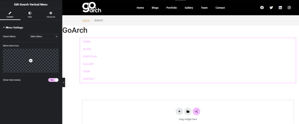
- Select Menu: Click this primary dropdown selection frame to pull available database menu architectures from your site. As shown across
image_cd29e5.png, choosing a target structure like Main Menu automatically generates a vertical row tree containing your configured navigational endpoints (e.g., HOME, BLOGS, PORTFOLIO). - Menu Item Icon: Use this graphic picker box to load a global icon marker from your SVG library or FontAwesome repository to display right next to each vertical text row link.
- Show Sub-menus: A master operational switch module. Set this toggle to Yes to allow nested multi-level page configurations to display gracefully beneath their respective parent tabs when prompted.
Style Tab
The Style tab provides comprehensive layout controls over background containers, custom text paddings, line divisions, and active menu states.
Container Panel
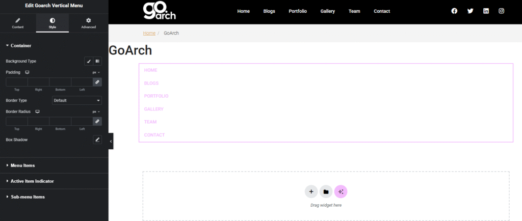
- Background Type: Click between the classic brush tool or gradient options to style the outer framing container canvas box enclosing your entire link group.
- Padding: Enter precise, multi-directional layout spacing parameters in pixels (
px) to build inner breathing room between the outer wrapper lines and your navigation elements. - Border Type: Set your global edge treatment using this dropdown option selection wheel (set to Default across
image_cd2a1f.png). - Border Radius: Slide or type in exact pixel metrics to round off the geometric corners of your master menu background container box.
- Box Shadow: Open this blurred offset control module to cast subtle depth accents underneath the primary vertical navigation section container canvas.
Menu Items Panel
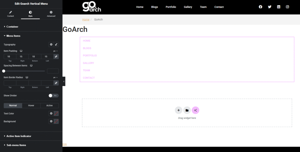
- Typography: Click the pencil editing symbol to define custom typography properties. Adjust your font family definitions, text sizes, font weights, line-height settings, and text transformations (such as forcing links to display in clean uppercase lettering).
- Item Padding: Enter targeted structural layout padding variables in pixels across the Top, Right, Bottom, and Left text input boxes. In
image_cd2a41.png, this parameter is configured to a balanced ratio of 10px Top/Bottom and 15px Right/Left. - Spacing Between Items: Move this slider to scale or compress the vertical gap distance separating each individual menu entry block from one another.
- Item Border Radius: Apply a curved rounding treatment exclusively onto individual item link hover boundaries or click tags.
- Show Divider: Switch this toggle button between Yes and No. Activating it draws clean structural lines between each menu link row to segment lists cleanly.
- State Selector Tabs (Normal / Hover / Active): Pivot between these three design modes to control how links render dynamically across different conditions:
- Normal: The baseline state of items resting on the screen template.
- Hover: The colorway configurations triggered when a user rolls their tracking pointer over a link card.
- Active: The permanent aesthetic style applied to the link tracking your user’s current destination page.
- Text Color & Background: Use the color picker block arrays or choose global theme hex swatches to independently paint your text characters and line backgrounds across each state condition.
Active Item Indicator Panel
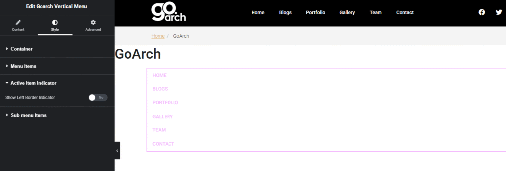
- Show Left Border Indicator: Toggle this setting to Yes or No (set to No in
image_cd2de1.png). When activated, it forces a solid, customizable vertical colored accent bar line to anchor directly against the left margin of the link node matching the active live page URL.
Sub-menu Items Panel
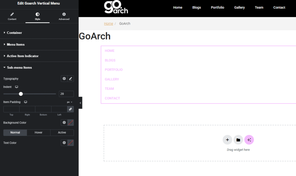
- Provides an isolated collection of duplicate style rules—including separate Typography, Text Color, Background, and Padding controls—crafted specifically to format lower-level, nested sub-navigation drop links without altering the parent layout metrics.
Advanced Tab
The Advanced Tab includes standard, system-wide customization features native to the core Elementor infrastructure engine. Use these cards if your menu requires custom exterior container margins, parent section cell paddings, scroll-triggered entrance motion animations, z-index layer stacking values, localized developer CSS custom class injections, or responsive design parameters to hide your vertical menu structure entirely across specific tablet screens, desktop layouts, or mobile smartphone viewports.
Tips & Best Practices
- Ensure Symmetrical Line Padding: When formatting text lines within the Menu Items Panel, always check that your link container padding remains symmetrically balanced. Setting top and bottom padding rows equally (e.g., 10px Top and 10px Bottom as highlighted across
image_cd2a41.png) prevents links from rendering awkwardly skewed. - Maintain High Active State Contrast: To help visitors navigate your web layouts easily, ensure your Active State text colors contrast distinctly against standard Rest or Hover states. This makes it instantly obvious which section of your site a user is browsing.
- Mind Nested Item Indentations: If you activate sub-navigation routes using the Show Sub-menus toggle, remember to jump into the Sub-menu Items Panel to add extra left padding. This pushes sub-links slightly to the right, establishing an intuitive, clean visual hierarchy.
Troubleshooting
The vertical menu is rendering completely blank or missing links on the live view
Verify that your data pipeline routing is correctly mapped. Go to your Content Tab -> Menu Settings Panel as shown across image_cd29e5.png and check the Select Menu input. If this field is left unassigned or links to an empty WordPress menu array that contains no active navigation paths, the widget wrapper will have no code to display.
The sub-menu items are overlapping or crowding parent menu lists
This issue is typically caused by conflicting font heights or compressed item spacing parameters. Navigate directly to the Style Tab -> Menu Items Panel displayed in image_cd2a41.png. Increase your Spacing Between Items or increase your pixel padding boundaries inside the Sub-menu Items Panel to allow nested navigation drop trees plenty of breathing room.