How Can We Help?
Header
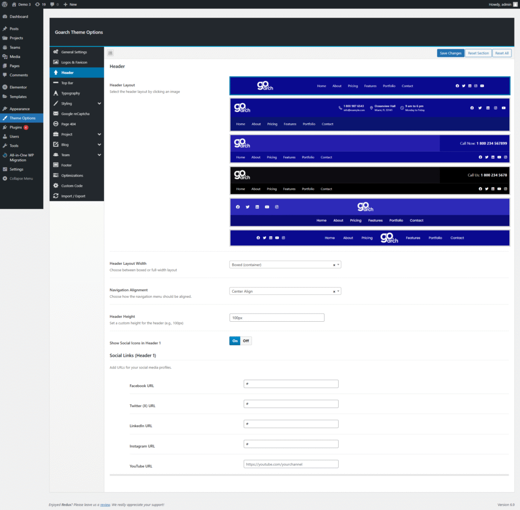
The Header section of the GoArch Theme Options lets you choose from 6 premade header layouts and then fine‑tune the design and behavior of the one you select. Each layout is optimized for architecture and interior design websites, with different logo positions, contact info areas, and social icons arrangements.
Choosing a Header Layout
At the top of the Header panel you will see a row of 6 header previews.
To select a layout:
- Click on any preview image to activate that header style for your site.
- After selection, the options displayed below will apply specifically to the chosen header (for example, some headers show contact details while others focus on a centered logo and navigation).
Once a layout is chosen, save changes and check the front‑end to confirm that the header matches your design direction.
Global Header Settings
Below the previews you have a set of global controls that affect the active header style:
- Header Layout Width – Choose between a boxed header (contained width) and a full‑width header that spans the entire browser window. This setting is useful if you want the header to align with either a boxed or full‑width page layout.
- Navigation Alignment – Controls how the main menu is aligned inside the header; typical options are Left Align, Center Align, or Right Align. In the screenshot, the menu is set to Center Align to give a balanced look.
- Header Height – Lets you set a custom height (in pixels) for the header area, for example
100px. Adjust this to keep the header compact or more spacious depending on your logo size and menu length.
These options apply to the currently selected header layout and help you maintain consistent spacing across all pages.
Social Icons for Header 1
Some header layouts, such as Header 1, include a dedicated social icons bar. When a header that supports social icons is active, you will see additional options:
- Show Social Icons in Header 1 – Toggle On/Off to display or hide the social icons row for that header. Turning it off removes the icons area entirely for a cleaner header.
- Social Links (Header 1) – Enter URLs for each social network you want to display:
- Facebook URL
- Twitter (X) URL
- LinkedIn URL
- Instagram URL
- YouTube URL
Only icons with non‑empty URLs will appear in the header, so you can limit the set to the platforms you actually use.
Header‑Specific Options for Each Layout
Each of the 6 premade headers can expose its own specific options once selected:
- Headers with a top info bar may provide fields for phone number, email, office address, and working hours.
- Layouts featuring a split design (logo on one side, menu on the other) can offer separate alignment or spacing controls for logo and navigation.
- Minimal headers may focus mainly on logo size, menu alignment, and sticky behavior, while more complex headers support social icons and secondary menus.
After switching to a different header preview, always scroll down the panel to see if new fields appear that are unique to that layout, then configure them before saving.
Saving Your Header Settings
When you finish configuring a header:
- Click Save Changes in the top‑right of the Theme Options panel to apply the new layout and settings to your site.
- Use Reset Section if you want to revert only the Header settings to their defaults, or Reset All to restore every theme option back to the original state.
This Header panel allows you to quickly test each of the 6 premade designs and then refine the selected header with layout width, navigation alignment, height, and layout‑specific options for a polished GoArch website.