
How Can We Help?
GoArch Clients
Goarch Clients Widget
The Goarch Clients widget is a clean, trust-building Elementor element designed to display partner logos, corporate clients, or sponsor brands on your architecture or real estate website. By showcasing recognizable brand marks alongside structured call-to-action links, this element helps build immediate professional credibility, establish industry authority, and demonstrate social proof to prospective clients.
Feature Overview
- Intuitive Grid Repeater: Effortlessly add, clone, or rearrange multiple client logo nodes using a streamlined list manager.
- Toggleable Action Links: Control the visibility of interactive call-to-action text links (e.g., “View All”) underneath your grid layouts with a simple global toggle switch.
- Individual Landing Routes: Assign dedicated external or internal URLs to individual client logos to guide users directly to project case studies or partner profiles.
- Dual-State Interaction Control: Customize distinct typography configurations and hover states for text blocks and link triggers to match your corporate branding.
Step-by-Step Instructions
Follow these clear configuration steps to integrate and manage a Goarch Clients block:
- Launch your target page layout inside the active Elementor editor panel.
- Search for Goarch Clients via the left-hand elements menu input field.
- Drag the widget and drop it into your preferred row or section container.
- Set your global block titles, toggle action buttons, and provide anchor URLs under the Content tab.
- Expand individual repeater items to upload client brand graphics and configure direct landing page links.
- Pivot over to the Style tab to systematically match header typography, color paints, and mouse-hover behaviors with your active site design.
Explanation of Settings
Content Tab
The Content tab provides structural options to manage global text copy, button interaction rules, and individual client asset arrays.
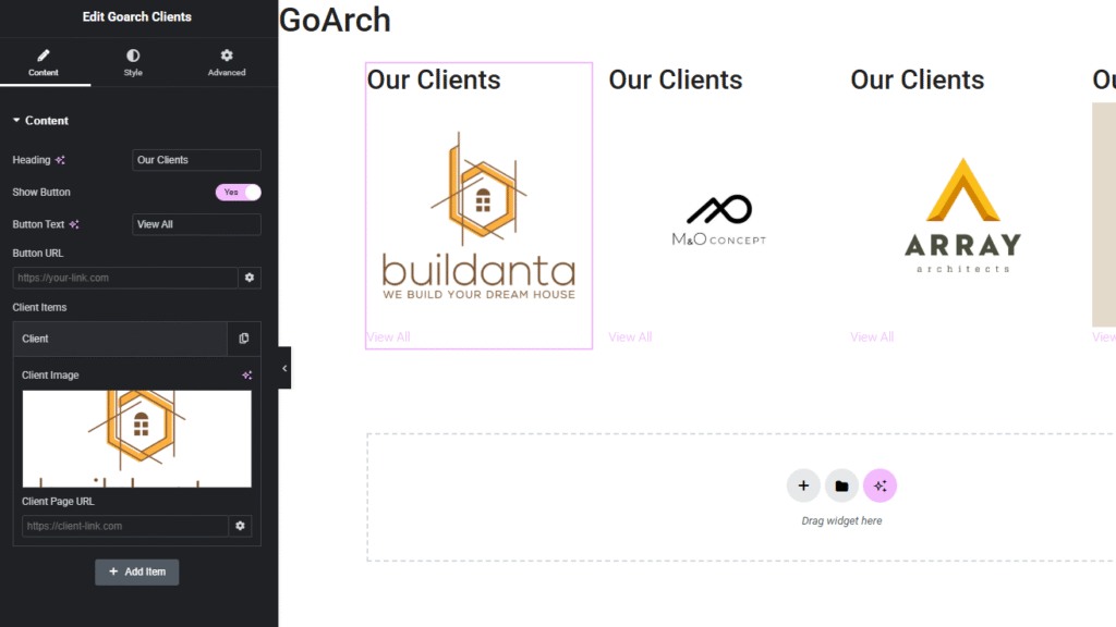
Content Panel
- Heading: Input the global title text string that establishes the purpose of the section (e.g.,
Our Clients). - Show Button: A toggle switch to enable or disable the interactive text link beneath the client assets. Set this to Yes to show the action link, or toggle it off to display raw logos.
- Button Text: Define the display text string for your action links (e.g.,
View All). - Button URL: Enter the overarching target destination link or anchor path for the global action trigger. Click the gear icon to configure advanced link options, such as opening the link in a new window or appending
nofollowattributes.
Client Items Panel
This repeater section manages the list of individual client logo assets:
- Repeater Items List: Click any existing item block (e.g., Client) to expand its data fields, use the copy icon to duplicate an entry, or click the X icon to delete a row. Click + Add Item to append a brand-new logo node to the bottom of the loop.
- Client Image: Click the image field container to select or upload a high-quality client brand icon or logo from your WordPress Media Library.
- Client Page URL: Input the specific, standalone web link address designated for that particular client logo frame, allowing users to navigate to detailed individual portfolio breakdowns.
Style Tab
The Style tab features dedicated customization tools to polish your headers and configure active hover styling for interactive items.
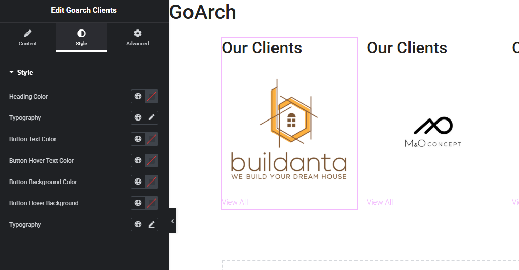
Style Panel
- Heading Color: Assign a custom hex code or global theme color palette paint to your main section title text strings.
- Typography (Heading): Fine-tune the font family style, scaling sizes, line-height tracking, character transformations, and font-weight thickness rules applied to the client headers.
- Button Text Color: Select the default text color swatch for your action buttons and text links.
- Button Hover Text Color: Choose the specific color transformation applied to the button text string when an online visitor hovers their cursor over the link element.
- Button Background Color: Set a solid background color fill to sit behind your action links if rendering them as solid button blocks.
- Button Hover Background: Define the interactive background transition color that activates during a mouse-hover event.
- Typography (Button): Curate localized font families, lettering scales, decoration styles, and weights specifically for the interactive text elements.
Advanced Tab
The Advanced Tab includes Elementor’s standard parent container configuration panels. Use these parameters if your client logo showcase requires exact margin or padding modifications, scroll-driven entry motion animations, precise layout layer z-index values, targeted custom CSS class definitions, or responsive visibility rules to selectively hide or show the logo row across desktop monitors, tablet viewports, or mobile screens.
Tips & Best Practices
- Use Transparent PNG or SVG Formats: To maintain a clean visual look, ensure all client logos use a transparent background (preferably saved as optimized WebP, transparent PNG, or clean vector SVG shapes). Logos with solid white bounding boxes can look disjointed on pages that feature off-white or dark section canvas backgrounds.
- Normalize Logo Proportions: Client brand assets come in many shapes—some are wide rectangles while others are tall squares. For best visual flow, crop your logo graphics onto matching transparent canvas shapes before uploading them. This keeps your horizontal alignment rows perfectly uniform.
- Leverage Case Study Landing Pages: Instead of linking client logo nodes back to your clients’ external websites, use the Client Page URL field to route visitors directly to internal project breakdown posts on your website. This strategy demonstrates your real-world workflow while keeping valuable traffic engaged on your domain.
Troubleshooting
The action button or “View All” link is missing on the page layout
Check the status of the Show Button toggle switch inside the Content tab panel, as displayed in image_e05c02.png. If this switch is accidentally set to the left (disabled state), the text links will remain hidden on the frontend layout framework regardless of what copy is typed inside the text input box.
The text color is completely unreadable against my section container
If your client headers or links are fading out or difficult to read against the page canvas, jump over to the widget’s Style tab panel shown in image_e05c22.png. Manually update the Heading Color and Button Text Color swatches to highly contrasting alternative colors or distinct global theme swatches that pop clearly on the screen.