
How Can We Help?
GoArch Google Map
The Goarch Google Map widget is an intuitive Elementor element designed to embed interactive, responsive maps directly onto your website. Whether you want to feature an architectural studio location, a construction project site, or an office headquarters, this module embeds a live map layout seamlessly without needing complex iframe codes.
Feature Overview
- Instant Address Pinpointing: Drop location pins accurately by typing simple, human-readable address text strings.
- Granular Zoom Control: Control map proximity dynamically to give users broad regional context or precise block-level navigation.
- Custom Height Adaptability: Adjust vertical container proportions directly inside the layout parameters to blend harmoniously with surrounding page sections.
Step-by-Step Instructions
Follow these clear, actionable steps to insert and configure a Goarch Google Map component:
- Open your target page template or canvas with the Elementor editor panel active.
- Search for Goarch Google Map in the left-hand elements search bar.
- Drag the widget and drop it into your preferred section row or contact page column.
- Input your custom address data within the Content tab.
- Adjust the height and zoom parameters to optimize structural display proportions.
Explanation of Settings
Content Tab
The Content tab contains core operational parameters to define your physical location and structure the map viewport.
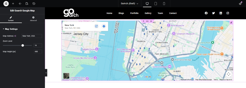
Map Settings
- Map Address: Enter your location coordinates or written address directly into this text field (e.g.,
New York, USA). The integrated layout engine automatically converts this string to a live interactive pinpoint. - Zoom Level: Move the range slider or type a precise numeric scaling factor (ranging up to
20) to govern the initial viewpoint scale. A value like14offers an optimal balance between main city sectors and local street junctions. - Map Height (px): Define the static vertical pixel dimensions for the map frame container (e.g.,
400). This ensures the map box takes up the ideal proportion of screen real estate relative to nearby text and forms.
Advanced Tab
The Advanced Tab exposes standard native Elementor container properties. From this panel, you can tweak structural margin/padding bounds, add stylish entrance animations, assign custom target CSS IDs or classes for layout overrides, or configure conditional device visibility breakpoints to hide or display the map layout across Desktop, Tablet, and Mobile views.
Tips & Best Practices
- Be Specific with Addresses: If a generalized city name isn’t loading the exact pin position, type the complete street address along with its postal code (e.g., 123 Architecture Lane, New York, NY 10001) for absolute accuracy.
- Optimize Viewport Heights: For dedicated contact pages, a taller height bound (like
450pxto500px) works wonders. If you are placing a map block side-by-side with an operational contact form, match the map height parameters to the vertical size of the form for symmetrical layout cleanliness. - Set Strategic Zoom Levels: If you are highlighting a rural site or real estate development zone, a wider zoom perspective (
10to12) is ideal. For downtown urban offices, dial the zoom up (16or higher) so users can identify adjacent crossroads and parking landmarks.
Troubleshooting
The map is blank or failing to load completely
Double-check your spelling inside the Map Address field. Ensure there are no trailing broken characters or misplaced symbols in your text string. If the problem persists globally, check your site-wide theme configuration panel to ensure a valid Google Maps API Key has been linked successfully to authorize layout lookups.
The map feels too small or overflows clumsily on mobile screens
While the width scales responsively to fill 100% of its assigned column, the Map Height remains constrained by the static pixel value configured in your settings. If the canvas looks too cramped on smartphones, utilize the built-in Elementor responsive preview mode to verify container scaling, or create an alternative layout block explicitly optimized for mobile viewports.