
How Can We Help?
GoArch Contact Form
The Goarch Contact Form widget is a robust, lightweight lead generation element tailored for real estate, architecture, and design agencies. It allows you to build custom inquiry forms directly inside Elementor, collect user submissions, and direct notification alerts to your designated administrative inbox without requiring heavy external form builder plugins.
Feature Overview
- Custom Field Builder: Add, arrange, and configure text, email, and multi-line message fields to capture structured lead data.
- Direct Email Routing: Define a target recipient email address to receive immediate delivery of all front-end form submissions.
- Granular Aesthetic Control: Take complete style control over typography scales, field gaps, placeholder colors, and button hover states to fit your brand identity.
- Responsive Column Layouts: Adjust individual input field widths and overall form alignment to design symmetric multi-column layouts across desktop, tablet, and mobile screens.
Step-by-Step Instructions
Follow these clear, actionable steps to insert and configure a Goarch Contact Form element:
- Launch your target page layout within the active Elementor editor interface.
- In the left-hand elements search panel, type Goarch Contact Form.
- Drag the widget icon and drop it cleanly into your chosen section container or sidebar column.
- Set up your submission routing and build out your input data items under the Content tab.
- Move systematically through the subsections of the Style tab to fine-tune spacing parameters, branding color schemes, and structural layout thresholds.
Explanation of Settings
Content Tab
The Content tab houses essential organizational settings to build out the structural framework of your form fields and establish communication routing.
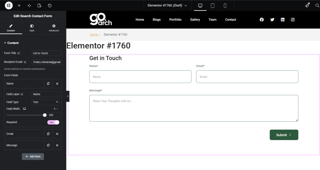
- Form Title: Enter a main heading statement (e.g.,
Get in Touch) to display directly above your form inputs. - Recipient Email: Specify the exact destination email address (e.g.,
7miles.infodesk@gmail) where all front-end form entries will be delivered as an automated alert notification. - Form Fields List: View, reorder, clone, or delete individual input line items. Click + Add Item to introduce a brand new input field to the form layout.
- Field Label: Set the text marker that sits immediately above or within the field bounds (e.g.,
Name). - Field Type: Select the text format validation framework from the dropdown menu (e.g., Text, Email, or TextArea).
- Field Width: Adjust the responsive slider to control how much horizontal space the field occupies relative to the column row wrapper (set to
100for a standalone line, or50to fit two items side-by-side). - Required: Toggle to Yes to make submission impossible without filling out that specific block.
- Field Label: Set the text marker that sits immediately above or within the field bounds (e.g.,
Style Tab
The Style tab is packed with extensive presentation adjustments grouped systematically into design blocks.
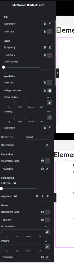
Title
- Typography & Title Color: Select your brand’s font configurations (size scale, line heights, font families) and specify custom color swatches or hex properties for the main form heading text layer.
Labels
- Typography & Label Color: Customize the visual presentation of the field description text that sits directly above each input.
- Label Spacing: Use the range slider to increase or decrease the vertical distance between the field label text string and the corresponding input field boundary line.
Input Fields
- Text Color / Background Color: Format the exact color of typed characters along with the solid background tile layout inside the input box elements.
- Border Radius & Padding: Link or unlink pixel coordinates to define corner roundness thresholds or fine-tune internal spacing values inside the text frames.
- Typography: Manage font families, weights, and text scales for live user inputs.
- Border Type & Box Shadow: Choose a solid, dotted, or default border style frame contour, or introduce outer drop shadows to lift inputs off the canvas.
Placeholder
- Placeholder Color & Typography: Manage distinct text scaling properties and softer color profiles applied directly to un-filled placeholder prompt instructions (e.g.,
Share Your Thoughts with Us...).
Form Layout
- Field Gap: Slide the responsive spacing indicator to safely adjust the global horizontal and vertical whitespace margins separating the adjacent input boxes.
- Alignment: Instantly alter the orientation flow path for your form elements between Left, Center, or Right alignments via the device layout buttons.
Button
- Background Color / Text Color: Configure high-contrast color values for the main submission box frame (e.g.,
Submit >) to drive form completions. - Border Radius & Padding: Set custom unlinked pixel bounds for outer buttons to establish proper sizing proportions.
- Typography: Customize font sizing scales, structural weights, and letter-spacing options specifically for the button’s action text layer.
Advanced Tab
The Advanced Tab includes native Elementor layout engines. From here, you can assign advanced custom margins, configure distinct entry motion effects, tweak layout z-index priorities, append targeted custom CSS IDs or layout classes, or leverage standard responsive breakpoint toggles to show or hide the inquiry module entirely on selective hardware screen types.
Tips & Best Practices
- Boost Form Completion Rates: Keep your forms brief and to the point. Sticking to 3 or 4 mandatory fields (such as Name, Email, and Message) maximizes engagement and prevents users from abandoning the form due to questionnaire fatigue.
- Build Multi-Column Layouts: You can easily display your inputs side-by-side to make better use of vertical screen space. Simply go to the Content tab, expand your first two fields (e.g., Name and Email), and change their Field Width parameters from
100%down to50%. - Ensure Contrast Compliance: Make sure your Placeholder Color isn’t too light against your chosen input Background Color. Maintaining clear readability keeps your form highly accessible and user-friendly for all web visitors.
Troubleshooting
I am not receiving submission alerts to my notification inbox
First, verify that your email address is spelled perfectly inside the Recipient Email block in the Content tab. If the address is correct, the automated notifications might be getting caught in your email server’s spam filter. We recommend configuring a standard WordPress SMTP plugin to authenticate your site’s outgoing mail delivery and ensure notifications land safely in your primary inbox.
Input text fields look squeezed or vertically crushed
This typically happens when manual Padding fields are unlinked inside the Input Fields configuration zone without setting safe clearance heights. Simply reset your padding values to default or add unlinked baseline pixel offsets (e.g., 12px for Top and Bottom padding) to create a more breathable, professional text entry frame.