
How Can We Help?
GoArch Price Table
The Goarch Price Table widget is a clean, conversion-focused Elementor element designed to display tiered pricing packages, subscription plans, or service rates side-by-side. Featuring integrated itemized list parameters, distinct cost callouts, and direct action buttons, this widget allows architecture firms, agencies, and service providers to present clear, transparent purchasing options to prospective clients.
Feature Overview
- Multi-Column Layout Grid: Seamlessly arrange your pricing tiers in multi-column displays to create a balanced horizontal comparison view.
- Nested Feature Management: Embed customizable feature checklists within each specific tier card to specify exactly what is included in each package.
- Comprehensive Font & Color Swatches: Individually edit background fills, headings, currency tags, feature line entries, and action link buttons.
- Flexible CTA Integration: Configure target destinations and custom text overlays for each plan to streamline the user registration or purchasing flow.
Step-by-Step Instructions
Follow these clear structural steps to deploy and configure a Goarch Price Table grid:
- Launch your layout builder page workspace using the active Elementor editor panel.
- Type Goarch Price Table into the left-hand side elements search field.
- Drag the widget element card and drop it cleanly into a full-width container row.
- Input your tiered titles, financial values, feature inclusions, and hyperlinks under the Content tab.
- Head over to the Style tab to systematically alter your layout color palettes, custom typography families, and breathing margins.
Explanation of Settings
Content Tab
The Content tab provides structural options to modify global grid column arrangements and control the technical data parameters for each individual package layer.
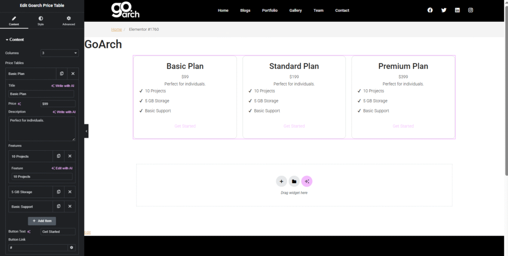
- Columns: Choose how many pricing plan rows display horizontally side-by-side within a single section layout framework (e.g., 3).
- Price Tables List: View, rearrange, clone, or delete individual package entries. Click an item card row (such as Basic Plan) to modify its explicit data layers:
- Title: Set the main tier label string (e.g.,
Basic Plan). - Price: Enter the numeric rate identifier or custom currency suffix/prefix configuration (e.g.,
$99). - Description: Provide a short summary or target audience tagline below the cost row (e.g.,
Perfect for individuals.). - Features (Sub-Repeater): Add, delete, or clone check items to outline plan deliverables (e.g.,
10 Projects,5 GB Storage,Basic Support). - Button Text: Customize the interactive hyperlink trigger text string (e.g.,
Get Started). - Button Link: Assign the destination URL landing path or dynamic e-commerce anchor link (e.g.,
#).
- Title: Set the main tier label string (e.g.,
Style Tab
The Style tab features specialized micro-controls to govern the typography scales, background containers, and interactive design states.
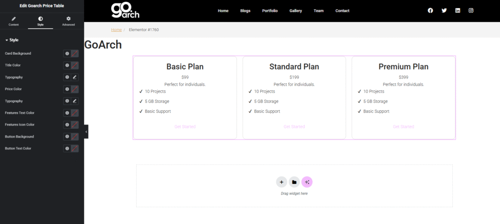
- Card Background: Define the primary backdrop fill canvas (solid, transparent, or custom hex) applied behind each standalone price card item.
- Title Color & Typography: Manage the distinct font family selection, line spacing scale, weight values, and paint properties for the primary tier header.
- Price Color & Typography: Direct the visual weight, scale proportions, and color values specifically for the prominent monetary rate layer.
- Features Text Color: Specify custom font colors applied to the informational description string paths within the item checklist blocks.
- Features Icon Color: Set independent color overrides for the graphic checkmarks or bullets accompanying the text layers to enhance legibility.
- Button Background & Button Text Color: Control the resting state and interactive presentation values of the call-to-action button containers and text blocks.
Advanced Tab
The Advanced Tab bridges into Elementor’s native parent layout layout metrics. This panel provides easy access for defining custom container margin offsets, configuring smooth entrance scroll motions, tweaking layer z-index priorities, assigning custom tracking CSS classes/IDs, or mapping responsive breakpoint visibilities to seamlessly show or hide pricing tiers on mobile hardware viewports.
Tips & Best Practices
- Keep Checklists Symmetrical: For a clean, visually professional layout, try to include the same number of feature rows across each adjacent card. If one card contains three bullet points and another contains seven, it can create awkward vertical gaps across the grid block.
- Create Strong Visual Hierarchy: Use the Price Color & Typography tools to make your monetary values pop. Making your price point notably larger or punchier than the surrounding subheadings helps users spot the core numbers instantly.
- Use Clear Action Prompts: Move beyond generic “Click Here” strings. Tailor your button text to the specific package tier—such as using “Try for Free” for a basic tier or “Contact Us” for premium, enterprise packages.
Troubleshooting
Price plan cards are unevenly sized or vertically misaligned
This usually happens when your internal text copy blocks or sub-feature items vary drastically in length from column to column. Ensure text descriptions utilize comparable sentence lengths. Alternatively, check your parent Elementor section container layout metrics and verify that column alignment properties are configured to a uniform fill or stretch state.
Checklist icons are completely invisible on the front end
If your text labels show up but the leading bullets or checkmarks do not, look at the Features Icon Color parameter within your Style tab. The default configuration might be blending directly into your Card Background color choice. Pick a highly contrasting icon color to bring them cleanly into view.