
How Can We Help?
GoArch About Settings
The Goarch About Settings widget is a robust Elementor element tailored specifically for crafting comprehensive, professional “About Us” and company profile sections. It allows you to seamlessly blend structural corporate copy, core operational focus areas (specializations), and dynamic image galleries or sliders into a highly polished layout that builds brand authority and tells your company’s story effectively.
Feature Overview
- Unified Section Control: Manage global section anchors, main titles, and introductory narratives all within a single interface.
- Dual-Column Context Mapping: Implement deep informational hierarchies with secondary titles, supporting paragraphs, and specialized callouts.
- Inline Specializations: Highlight core business disciplines or industry certifications side-by-side using dedicated taxonomy fields.
- Flexible Image Repeater Block: Showcase high-quality architectural projects, interior mockups, or studio spaces using structured image lists equipped with individual tracking anchors.
Step-by-Step Instructions
Follow these clear configuration steps to integrate a Goarch About Settings block:
- Open your target page template inside the active Elementor editor canvas.
- Locate the Goarch About Settings element via the left-hand widget search directory.
- Drag and drop the widget directly into your desired layout container row.
- Define your primary headings, corporate narratives, and specialization nodes in the General settings dashboard.
- Populate and link your showcase images inside the Item Values repeater dashboard.
- Pivot to the Style tab to fine-tune font tracking, responsive spacing, and brand color alignment.
Explanation of Settings
Content Tab
The Content tab is divided into separate management zones to handle core branding copy and repeating graphic assets smoothly.
General Panel
This section outlines the baseline structural data and introductory textual components of your about layout block.
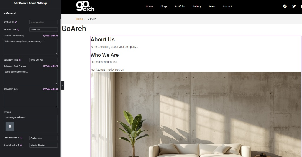
- Section ID: Assign a unique CSS selector identifier (e.g.,
about-section) to use this area for smooth-scroll single-page navigation menus. - Section Title: Input your overarching section heading (e.g.,
About Us). - Section Text Primary: A rich text zone to place your primary introductory statement or company mission sentence.
- Col About Title: Define the bold secondary heading used to transition into the deep details of your team or workflow (e.g.,
Who We Are). - Col About Text Primary: Input your primary block of descriptive body text outlining history, philosophy, or team execution values.
- Col About Info: An auxiliary textarea container to append extra technical statistics, side notes, or brand catchphrases.
- Images: A core WordPress gallery field used to bundle supporting visual assets into the element container when using default structural layouts.
- Specialization 1 & Specialization 2: Dedicated, clean inline text fields to call out your primary business vectors explicitly (e.g.,
ArchitectureandInterior Design).
Item Values Panel
This panel features a structured repeater engine designed to construct linked image showcases that support your copy block.
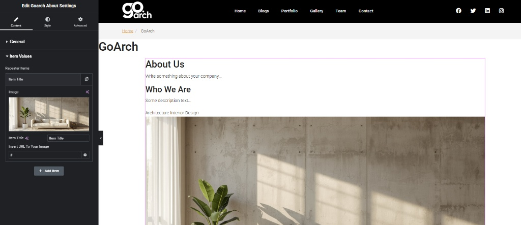
- Repeater Items: Click an individual slide block to configure its contents, or use + Add Item to append a clean asset container to the list loop.
- Image thumbnail: Click to upload or select custom interior or structural photography from your local WordPress Media Library.
- Item Title: Provide a descriptive text string or internal tracking name for the specific slide item.
- Insert URL To Your Image: Add a custom redirect link address or anchor path (use
#as a temporary placeholder) to point users to specific project case studies or detail sheets when the image frame is clicked.
Style Tab
The Style Tab provides precise typography dials to curate a beautifully readable text sequence. Use it to customize:
- Color palettes and family font parameters for Section Titles and Column Headings.
- Typography treatments, line leading space, and paragraph colors for both primary text blocks.
- Background color paints, frame padding matrices, and image alignment rules to ensure optimal contrast against the webpage canvas.
Advanced Tab
The Advanced Tab includes Elementor’s native layout controls. Use this panel to implement custom external margin dimensions, enable scroll-triggered entrance motion effects, alter layer stacking priority via z-index values, inject targeted developer CSS rules, or apply responsive viewport masks to hide or show the entire About block on specific desktop, tablet, or mobile phone screens.
Tips & Best Practices
- Utilize Section IDs for Navigation: By populating the Section ID field with a string like
about-section, you can create custom navigation links in your main menu. Simply configure a menu button to link to#about-sectionto enable a premium smooth-scroll effect directly to this block. - Balance Text Lengths: To ensure your text blocks flow perfectly alongside featured repeater images, keep your text within Col About Text Primary concise and balanced. This keeps your text block clean and maintains visual symmetry across widescreen desktop monitors.
- Optimize Image Assets: Because this widget renders expansive visual blocks beneath or beside your copy, ensure all photos uploaded via the Item Values tab are saved in compressed modern formats (like WebP). This guarantees fast loading times without sacrificing crisp display resolutions.
Troubleshooting
The layout text elements are completely blending into the section background
If your text headings are difficult to read or appear washed out, navigate straight into the widget’s Style tab. Review your custom color allocations for titles and body text, then pick highly contrasting colors or global style swatches that pop clearly against your section’s background color layer.
The repeater image links are reloading the page or broken
Check your inputs under the Insert URL To Your Image text fields within the Item Values repeater settings. Ensure every active field contains a complete web URL string (including https://). If an item is not linked to an external page yet, keep a single hash character (#) in the field to avoid broken asset calls.