
How Can We Help?
GoArch Objects
Goarch Objects Widget
The Goarch Objects widget (commonly referred to as an Image Hotspot element) is a highly interactive, visual annotation component built for the Elementor page builder. It empowers architects, interior designers, and real estate developers to place precise, clickable, or hover-triggered marker pins over any background image. When users interact with these pins, detailed informational tooltips appear, making it an exceptional tool for detailing blueprints, calling out specific landscape components, or explaining interior design finishes directly on a single master asset.
Feature Overview
- Precision Percentage Mapping: Position interactive marker pins down to the exact percentage coordinate over a core canvas background image.
- Rich Informational Tooltips: Equips each point of interest with a customizable popover box containing a dedicated header and rich text description body.
- Complete Dot Styling Engine: Adjust default colors, interactive hover states, and responsive focal sizing parameters for the physical pin targets.
- Fully Tailored Tooltip Canvas: Dictate the typographic styling, internal spacing padding, and framing border-radius of the overlay summary windows.
Step-by-Step Instructions
Follow these clear instructional steps to deploy and map out a Goarch Objects hotspot image:
- Launch your target page layout template from within the active Elementor editor interface.
- Type Goarch Objects into the left-hand widget search directory.
- Drag the element block and drop it directly into a clean section column row.
- Upload your primary showcase schematic or high-resolution graphic asset under the General settings dashboard.
- Head into the Objects repeater block to insert marker nodes, and tweak the percentage fields to position the interactive points over specific details.
- Navigate over to the Style tab to fine-tune pin sizes, hover transitions, and tooltip typography values.
Explanation of Settings
Content Tab
The Content tab allows you to configure your primary visual canvas backplate and program individual interactive point coordinates.
General Panel
This panel establishes the baseline presentation title and sets up your graphical background asset.
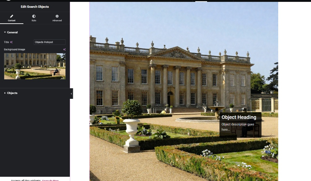
- Title: Input an internal or programmatic description string for the layout section (e.g.,
Objects Hotspot). - Background Image: Click the image selector container block to upload a high-resolution photo, master plan rendering, or elevation file from your WordPress Media Library to serve as the structural anchor canvas.
Objects Panel
This repeater matrix manages the generation, text input values, and specific layout coordinate mappings for each interactive marker.
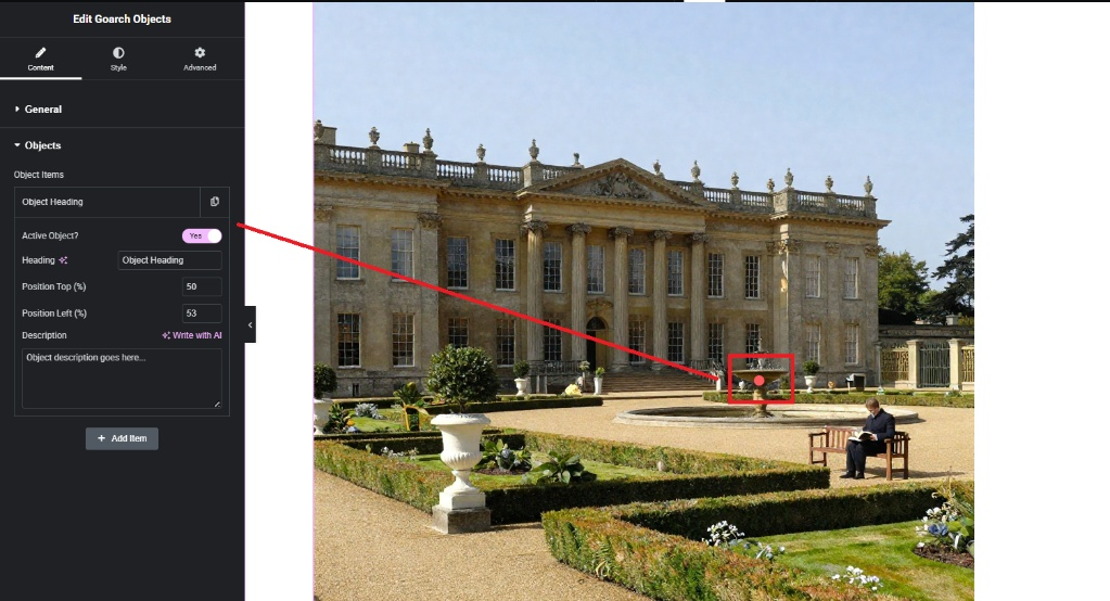
- Object Items Repeater List: Click an item row (e.g., Object Heading) to reveal its mapping configurations, or click the + Add Item button to spawn an entirely new hotspot pin overlay onto the layout container.
- Active Object?: A simple toggle switch to quickly highlight or focus an item. Set this to Yes to make the target marker block active or fully visible within the workspace preview frame.
- Heading: Input the short, punchy focal title text that outlines what the highlighted item is (e.g.,
Object Heading). - Position Top (%): Dictate the precise vertical location coordinate of the pin calculated from the top boundary line of the image canvas down. Entering a value (such as
50, as displayed inimage_e0d09b.jpg) shifts the marker down to the horizontal center line. - Position Left (%): Control the explicit horizontal location coordinate of the pin calculated from the left-most frame border over. For example, entering a value like
53maps the interactive point precisely over the center fountain fountainhead. - Description: A text area box to write detailed descriptions, material specifications, pricing notes, or structural info associated with that hotspot item.
Style Tab
The Style tab provides complete control over the design parameters of both the interactive anchor pins and their corresponding popover windows.
Dot Style Panel
This panel controls the look and sizing layer of the active map pins.
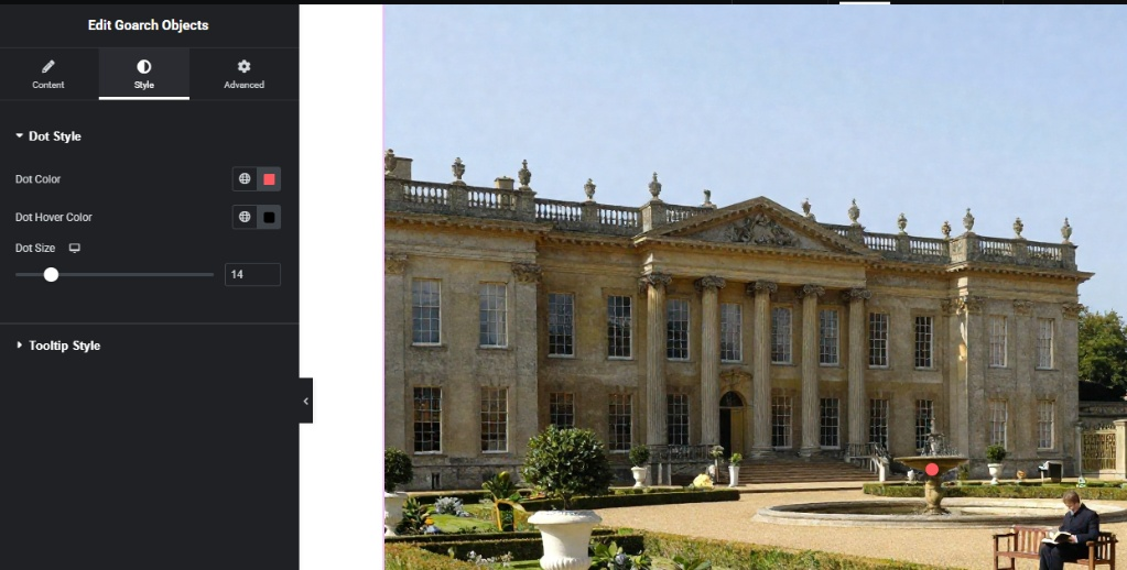
- Dot Color: Choose a solid color swatch or assign a global theme hex color to determine the default visual state of your map pins.
- Dot Hover Color: Choose the interactive color transformation that fires instantly whenever an online user hovers their mouse cursor directly over the marker pin.
- Dot Size: A responsive layout slider used to alter the global diameter thickness of your map pins in pixels (
px). Slide left or right or input a value (such as14) to reach your desired proportions.
Tooltip Style Panel
This panel styles the informational popover cards that open during user interaction.
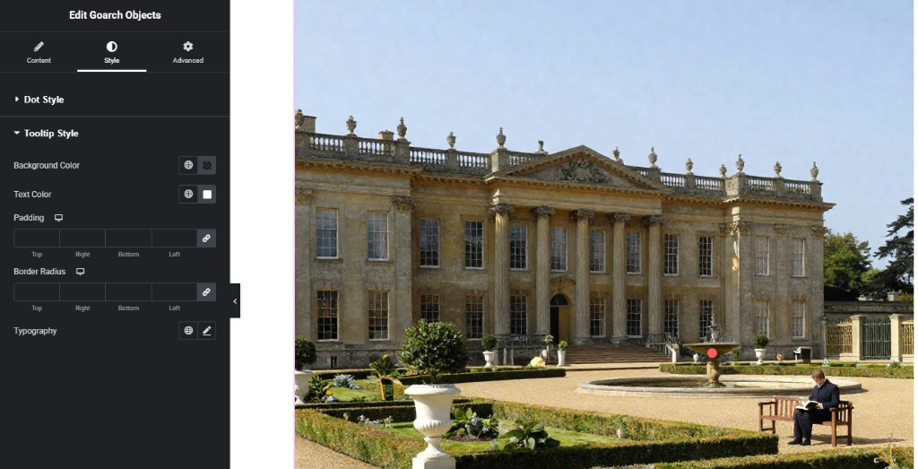
- Background Color: Set a custom background color layer fill or configure semi-transparent overlay tints to sit behind the tooltip textual string elements.
- Text Color: Update the universal typography color palette applied to your internal headings and description blocks.
- Padding: Provide responsive internal layout spacing values in pixels (
px) to create clear breathing room between text rows and outer card edges. - Border Radius: Enter pixel curve metrics to soften sharp corners into smooth rounded frames for the popup card structures.
- Typography: Use the edit pencil icon tool to configure font family trees, sizing metrics, character thicknesses, line-height leading, and transformations.
Advanced Tab
The Advanced Tab gives you access to Elementor’s standard parent layout integration suites. Use these modules if your hotspot container requires precise global margin shifts, scroll-driven entry motion animations, layer stacking priority adjustments using z-index values, custom developer CSS class designations, or responsive visibility rules to quickly hide or show the entire element across specific desktop monitors, tablet viewports, or mobile phone screens.
Tips & Best Practices
- Calculate Coordinates Graphically: Think of the positioning sliders as a standard graph grid where the top-left corner sits at
0% Top / 0% Leftand the bottom-right corner rests at100% Top / 100% Left. Using percentage metrics keeps your hotspots pinned securely to their intended structural details even when the background image automatically resizes to fit varying monitor dimensions. - Optimize Contrast for Visibility: Because background images can include highly detailed areas with mixed lighting, always configure a highly vibrant Dot Color (such as a high-visibility red or neon accent shade) that stands out clearly against dark shadows or bright sky backdrops.
- Keep Descriptions Concise: Tooltip windows are designed for quick, bite-sized updates. Keep text descriptions short and punchy to prevent the popover containers from growing too large and obscuring important sections of your background graphic asset.
Troubleshooting
The tooltip text box is completely cut off by the edges of the row container
This issue typically happens when a hotspot pin is mapped too close to the extreme outer borders of your image canvas (such as 2% Top or 98% Left). To remedy this, update the coordinates slightly to pull the pin closer toward the center area, or verify that your parent Elementor section or column wrapper is not configured to Overflow: Hidden.
The hotspot dots are shifting wildly out of position on smaller phone screens
Because mobile viewports display images with different responsive aspect ratios, always verify your layouts across devices. If your pins fall out of alignment on smaller viewports, tap the device icon next to the Position inputs or utilize the Advanced Tab responsive options to duplicate the section and optimize separate dedicated hotspot layouts for mobile screens.