
How Can We Help?
GoArch Experiance
The Goarch Experience widget is a minimal, high-impact Elementor element built to emphasize company longevity, team milestones, or core performance statistics. It combines an inline counter node, distinct headers, subheadings, and a dedicated layout graphic into a unified presentation block—ideal for showcasing milestones like “10 Years of Excellence” on a corporate profile or about page canvas.
Feature Overview
- Milestone Counter Focus: Provides a dedicated space to output numeric milestones, highlighting operational tenure or completed projects.
- Dual-Tier Text Hierarchy: Features independent title and subtitle strings to frame your statistical achievements with meaningful business context.
- Integrated Showcase Graphic: Links custom background or column graphics right inside the data loop to preserve layout alignment.
- Dynamic Media Scaling: Includes localized image resolution controls to maximize image clarity while safeguarding overall web load speeds.
Step-by-Step Instructions
Follow these clear configuration steps to deploy and manage a Goarch Experience milestone block:
- Open your target page layout inside the active Elementor editing canvas.
- Search for Goarch Experience using the element search filter on the left side.
- Drag the element block and drop it directly into your preferred section column.
- Input your primary headings, subheading context, and target data values under the Content tab settings.
- Upload or choose a supporting background image file from your media collection.
- Switch over to the Style tab to fine-tune typography mapping, interface colors, and display resolution scales.
Explanation of Settings
Content Tab
The Content tab provides entry fields to control your corporate milestone labels, tracking numbers, and contextual presentation graphics.
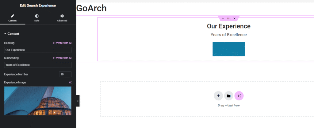
Content Panel
- Heading: Input the main section title or descriptive string to establish the context of the milestone block (e.g.,
Our Experience). - Subheading: Define a secondary context label line to sit beneath or near your core numeric output (e.g.,
Years of Excellence). - Experience Number: Input the raw numerical metric or target digit string you wish to feature prominently inside the layout container (e.g.,
10). - Experience Image: Click the graphical thumbnail placeholder selector box to upload or map a high-resolution architectural photograph, team capture, or project blueprint directly from your WordPress Media Library.
Style Tab
The Style tab houses your primary typography dials, color palette swatches, and asset resolution pipelines in a single dashboard layout.
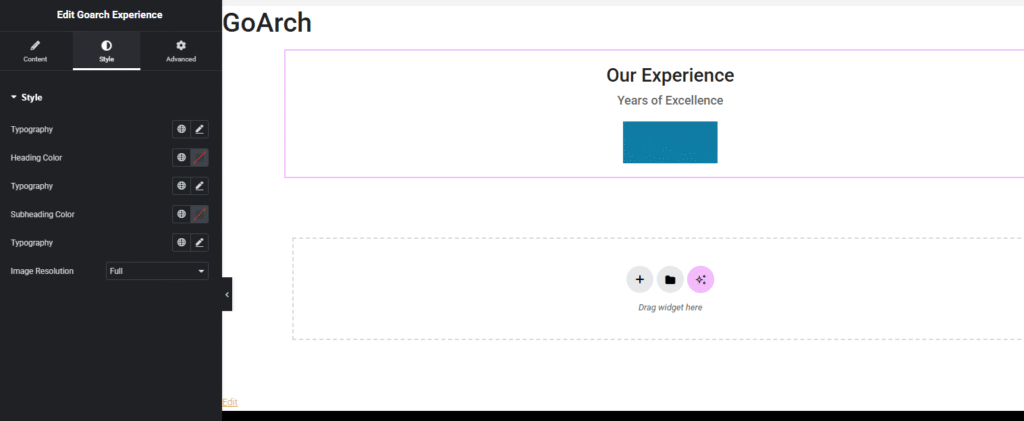
Style Panel
- Typography (Global/Numbers): Control the font family treatments, responsive formatting scales, line spacing adjustments, and letter weights applied directly to your primary values and text.
- Heading Color: Assign an explicit color swatch or match global site hex codes to style your primary heading text strings.
- Subheading Color: Choose a distinct color paint or secondary theme palette to format your secondary subtitle rows.
- Image Resolution: A drop-down configuration menu used to select the exact server-side crop dimension rules for your uploaded graphic asset. Setting this to Full (as shown in
image_e0e380.png) ensures your image displays at its original clarity without downscaling artifacts.
Advanced Tab
The Advanced Tab includes standard parent element customization modules native to the Elementor core engine. Use these panels if your milestone counter section requires explicit external margin shifts, internal frame paddings, scroll-triggered entry motion transitions, layout layer stacking priority numbers (z-index), custom layout developer CSS classes/IDs, or responsive viewport controls to hide or show the entire element block on desktop, tablet, or mobile phone screens.
Tips & Best Practices
- Coordinate Image Proportions: Because this widget relies on standard structural containers to position text blocks and graphic overlays gracefully, try to use a balanced landscape or square aspect ratio image. This ensures your headings and numbers align cleanly across widescreen layouts.
- Set Strategic Image Resolutions: While setting the Image Resolution drop-down option to Full guarantees maximum crispness on modern displays, remember to pre-compress your uploaded media file using an image optimization tool. This delivers a sharp look without introducing massive page weight penalties.
- Keep Typography Legible: Ensure that your chosen text color selections provide sufficient contrast against your section background theme. If your text overlaps with parts of your graphics, select high-contrast colors in the Style panel to keep the details easy to read.
Troubleshooting
The layout text blocks or numbers are overlapping awkwardly on smaller displays
If your layout text or numeric counters look squeezed or misplaced, check your custom typography scales under the Style tab dashboard shown in image_e0e380.png. Click the small device toggle shortcut icon next to the typography settings to adjust font sizes independently for tablet viewports and mobile screens.
The asset image looks noticeably blurry or pixelated on high-resolution screens
Review your active layout criteria inside the Image Resolution dropdown setting menu under the Style tab dashboard. If this option is set to a low compression preset like Thumbnail (150×150), switch the setting back to Full, then save your layout adjustments to pull the original high-resolution file onto your page canvas.