
How Can We Help?
GoArch Portfolio
The Goarch Portfolio widget is a robust, dynamic Elementor element designed to exhibit architectural portfolios, project case studies, or design galleries. It seamlessly bridges the gap between static content layouts and dynamic data layers, enabling firms to pull existing project posts directly into gorgeous grids or build standalone gallery showcases on the fly. Complete with built-in metadata parsing, category tagging, and structural demo templates, this widget provides a polished layout for presenting creative works.
Feature Overview
- Hybrid Data Architecture: Choose between manual list aggregation or query-based automated population pulled directly from custom post configurations.
- Integrated Layout Presets: Instantly toggle between distinct composition formats, including structural grids, minimal asset blocks, and fluid masonry grids.
- Granular Query Controls: Specify project display limits, sorting criteria, and chronological sequencing parameters directly from the layout engine.
- Comprehensive Style Mapping: Individually configure container backdrops, content frame paddings, image boundary curvatures, and specialized typographic layers.
Step-by-Step Instructions
Follow these clear structural steps to deploy and configure a Goarch Portfolio showcase array:
- Launch your target page template inside the active Elementor editor canvas interface.
- Use the left-hand elements menu index to search for Goarch Portfolio.
- Drag the widget block and drop it directly into an open section or full-width column container.
- Set your core engine data pipeline inside the Data Source configuration drop-down menu under the Content tab.
- Choose your target layout architecture via the Select Design Demo drop-down menu.
- Pivot over to the Style tab to systematically align item card boundaries, spacing padding parameters, typography sizes, and palette swatches with your brand guidelines.
Explanation of Settings
Content Tab
The Content tab manages your data routing pipelines, structural template selections, and post query limits.
Portfolio Settings Panel
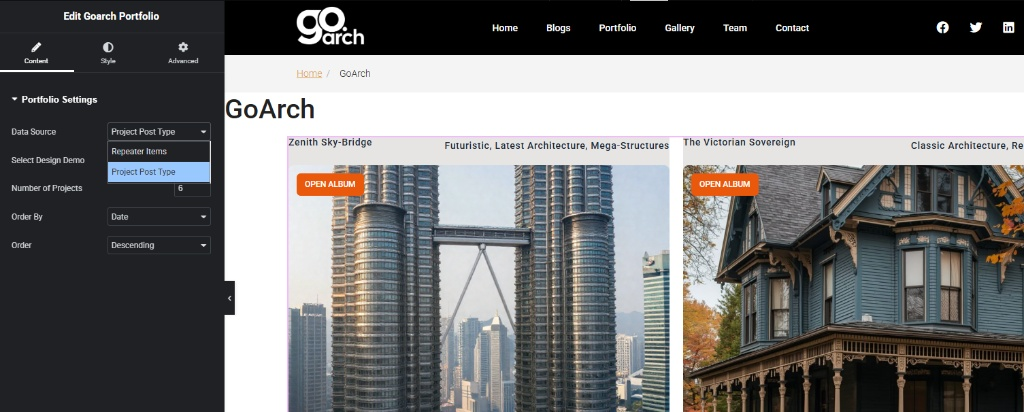
- Data Source: Use this primary selector to establish the underlying loop logic for your portfolio array. Selecting Project Post Type configures the system to query dynamic global database entries automatically. Alternatively, switching to Repeater Items unlocks a localized manual builder window for building custom individual slides from scratch.
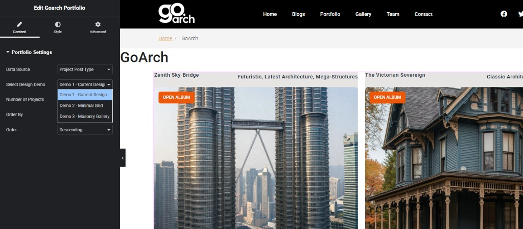
- Select Design Demo: Click this dropdown window to cycle through pre-rendered global alignment layouts. As shown across
image_85c787.jpg, you can instantly toggle between three primary visual configurations:- Demo 1 – Current Design: A cinematic split card composition displaying title labels, categorization subtitles, and prominent OPEN ALBUM action link overlays.
- Demo 2 – Minimal Grid: A clean, space-saving format that eliminates unnecessary container boundaries to focus strictly on structural imagery.
- Demo 3 – Masonry Gallery: An organic staggered layout that accommodates images of varying heights without cropping.
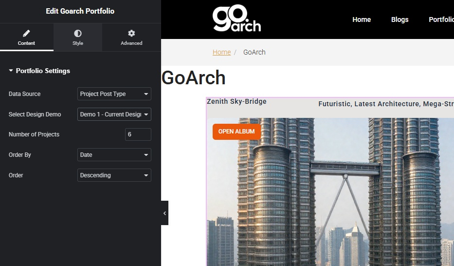
- Number of Projects: Input a definitive numerical threshold integer (e.g.,
6) to cap the absolute quantity of portfolio entries allowed to populate on the live page template at one time. - Order By: Declare the precise technical parameter string used to organize the resulting project row loops. Select Date to organize by the original creation timeline.
- Order: Control the chronological flow direction of the project list. Set this option to Descending to prioritize your newest project updates first, or choose Ascending to display historical posts chronologically.
Style Tab
The Style tab provides localized adjustments to manage container spacing, card accents, image treatments, and typography options.
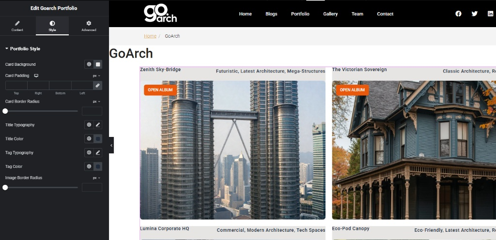
Portfolio Style Panel
- Card Background: Define a solid background color layer block or choose global theme hex swatches to format the outer framing behind text strings and thumbnails.
- Card Padding: Enter targeted structural layout padding values in pixels (
px) across the top, right, bottom, and left input zones to establish consistent breathing room inside the project block boundaries. - Card Border Radius: Adjust this layout slider or type in specific pixel metrics to round off the outer corners of the background card structures.
- Title Typography: Click the pencil edit tool icon to manage font family selections, scaling dimensions (
px,em), font-weight distributions, line heights, and character letter-spacing rules for the primary project names (e.g., Zenith Sky-Bridge). - Title Color: Adjust the color picker palette value to style the primary text row labels.
- Tag Typography: Launch the inline text styler module to configure separate structural font rules, text transformations, and sizes for the secondary categorization tags.
- Tag Color: Set the explicit color assignment applied directly to the sub-headline metadata tag clouds (e.g., Futuristic, Latest Architecture).
- Image Border Radius: Move this slider tool or enter pixel parameters (as highlighted across
image_85c7e6.jpg) to introduce curved corners exclusively to the featured project thumbnail images without affecting the outer text layout blocks.
Advanced Tab
The Advanced Tab provides standard layout integration parameters built directly into the Elementor architecture. Use this panel to adjust external element margins, assign scroll-triggered entrance motion animations, configure structural layout layer z-index stacking priorities, declare custom element classes for developer CSS target injections, or toggle responsive design rules to selectively hide or show your entire portfolio grid across desktop monitors, tablet viewports, or mobile phone screens.
Tips & Best Practices
- Leverage the Post Type Engine: For scalable website administration, choose Project Post Type as your primary data source. This ensures that whenever your studio uploads a fresh portfolio page through the main WordPress dashboard, it will automatically populate across your Elementor layouts without manual rebuilding.
- Standardize Featured Thumbnails: When utilizing Demo 1 or Demo 2, crop your featured project images to identical aspect ratios prior to media library uploading. Consistent image sizes ensure grid elements line up symmetrically across the horizontal plane. Use Demo 3 (Masonry Gallery) if your design layouts require mixed landscape and portrait image shapes.
- Mind the Tag Term Overflows: Keep category tag designations concise. Long strings of text or excessive tag selections can wrap awkwardly into multiple lines, stretching individual columns out of alignment with the rest of your portfolio row.
Troubleshooting
The portfolio area is rendering completely blank on the live frontend view
Verify that your Data Source selection is correctly aligned. If this parameter is set to Project Post Type but you have not yet populated actual entries inside your WordPress “Projects” post dashboard, the widget will have no content to generate. If you do not wish to use global posts, switch the configuration setting over to Repeater Items to manually insert individual item records.
The layout images appear squeezed, or grid columns look uneven across the layout
Check the Image Border Radius and Card Padding settings inside your Style panel dashboard shown in image_85c7e6.jpg. Ensure your structural padding configurations are linked symmetrically. If columns continue to align unevenly, check that the title lengths or category tag lines match in length, or apply custom typography size limitations using the responsive viewport tools.