
How Can We Help?
GoArch Gallery
The Goarch Gallery widget is a clean, modern visual showcase block built for the Elementor page builder. It allows studios, photographers, and architects to craft interactive media grids, design lookbooks, or showcase completed project photos. Each gallery item is wrapped in a sleek card profile complete with rounded corners, a distinct text title label, and an interactive anchor link arrow to seamlessly redirect users to specialized detail pages.
Feature Overview
- Responsive Column Layouts: Dynamically swap between multi-column grid matrices to seamlessly fit wide desktop workspaces or narrow mobile screens.
- Dynamic Repeater Core: Hand-build and stack as many individual gallery image entries as needed using an intuitive, drag-and-drop repeater menu.
- Minimal Typographic Callouts: Keeps the emphasis squarely on your visual assets by utilizing localized title labels positioned cleanly beneath each graphic element.
- Streamlined Styling Engine: Provides isolated control over title typography families, line spacing, and color presets to ensure perfect brand alignment.
Step-by-Step Instructions
Follow these clear structural steps to deploy and build out a Goarch Gallery element:
- Launch your target page layout or archive template from within the active Elementor design workspace.
- Search for Goarch Gallery using the element search entry bar on the left panel directory.
- Drag the widget block and drop it directly into a clean section row or layout column.
- Expand the Gallery Items setting matrix under the Content tab to start populating your visual library.
- Click + Add Item to create a new slider card, then upload an asset and write a corresponding label title string.
- Head over to the Style tab to systematically alter typography sizing rules, fonts, and color paints.
Explanation of Settings
Content Tab
The Content tab provides layout composition parameters, responsive column matrices, and manual item entry loops.
Gallery Items Panel
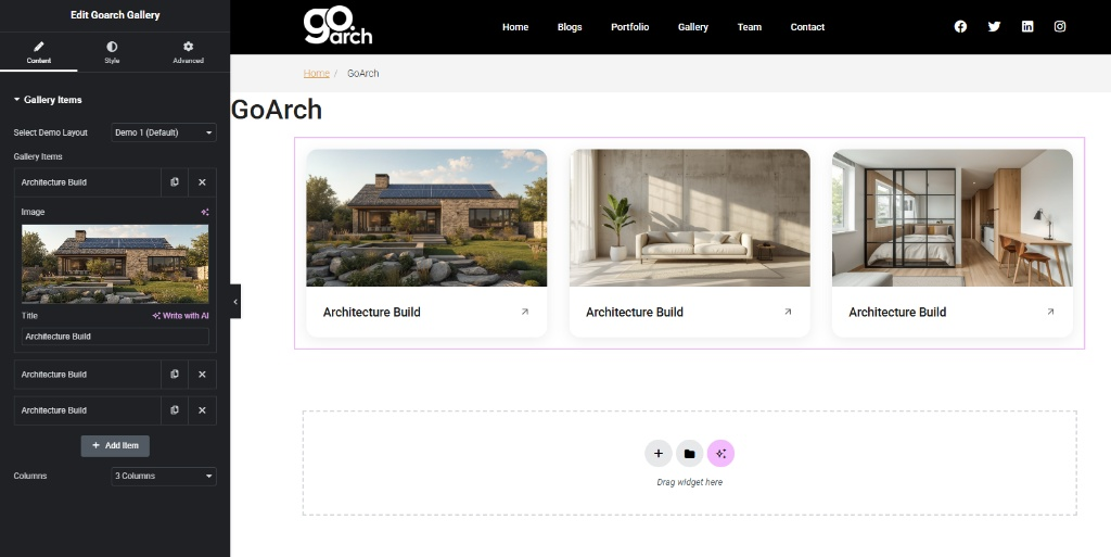
- Select Demo Layout: Choose your base presentation preset format from this global dropdown selection. By default, setting this to Demo 1 (Default) provides a unified card grid setup with bottom-aligned title text and inline link arrows.
- Gallery Items Repeater List: Manage individual gallery rows within this nested loop framework. You can click the duplicate icon to clone an asset row, or click the X icon to delete an item entirely. Expand any entry row (e.g., Architecture Build) to customize its specific attributes:
- Image: Click the media selector frame to pick a high-quality rendering or project photo from your WordPress Media Library.
- Title: Input a specific project title or structural description text string directly into this input field (e.g.,
Architecture Build). - + Add Item: Tap this button to instantly append a fresh, blank gallery slide item row to the bottom of your existing repeater list loop.
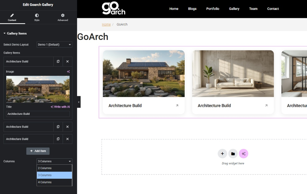
- Columns: Click this selection menu to dictate how many horizontal column nodes partition the layout frame on desktop viewports. As demonstrated in
image_85d345.jpg, you can explicitly lock your grid behavior into: - 2 Columns: Best for widescreen showcases or displaying highly detailed landscape visuals.
- 3 Columns: The standard proportion ratio for balanced portfolio lookbooks.
- 4 Columns: Optimized for denser collections or smaller thumbnail asset lists.
Style Tab
The Style tab provides clean, simplified access to your primary typography rules and accent colors to customize your card labels.
Style Panel
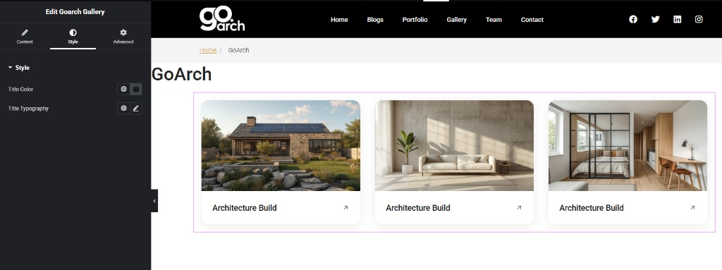
- Title Color: Tap the color swatch indicator or global globe icon to pick a solid hex color code or custom theme paint to apply to all gallery text labels.
- Title Typography: Launch the core Elementor typography controller by clicking the pencil editing icon. From here, customize specific font families, font weights, line heights, uppercase/lowercase transformations, and pixel (
px) sizing scales across desktop, tablet, and mobile devices independently.
Advanced Tab
The Advanced Tab includes Elementor’s standard layout adjustment suites. Use these settings to define precise pixel margins, custom internal column padding, enter scroll-driven element entrance animations, manage layer stacking priority index scores (z-index), configure custom developer CSS class designations, or activate responsive visibility rules to quickly hide the gallery array entirely across target desktop computers, tablet viewports, or mobile phones.
Tips & Best Practices
- Enforce Uniform Aspect Ratios: To ensure the bottom card title rows and interaction arrow symbols line up perfectly on a level horizontal plane, pre-crop all your gallery source images to the exact same aspect ratio (such as 16:9 widescreen or 4:3 standard) before uploading them to your WordPress media directory.
- Optimize Image File Weight: Because galleries load multiple high-quality graphical assets concurrently on a single page viewport, always compress your images through an optimization tool to avoid loading massive file sizes that can slow down your site’s speed performance.
- Leverage the AI Writing Assistant: If you need to generate quick, descriptive variations for your project titles on the fly, tap the inline Write with AI magic sparkle button located right inside the title entry panel field.
Troubleshooting
The card grid items are uneven and shifting awkwardly out of alignment
This layout variance is usually caused by using images with mismatched vertical heights. If your source files cannot be pre-cropped to match identically, you can place the Goarch Gallery widget inside an Elementor column wrapper that has a forced uniform height constraint, or swap between the column count modes inside the Columns setting menu shown in image_85d345.jpg.
The text titles are completely invisible against the background canvas
Navigate directly into the Style Tab menu displayed across image_85d37d.jpg. Check the current paint swatch state inside the Title Color selector box. If it accidentally matches the core background theme color of your section column, pick a high-visibility contrasting color shade to make your typography crisp and easily legible for web visitors.