
How Can We Help?
GoArch Video Grid
The Goarch Video Grid widget is a powerful, highly visual Elementor element crafted to present video galleries, architectural walkthroughs, client testimonials, or project design reels. By combining flexible multi-column grid layouts with fully customizable video cover thumbnails and precise play button positioning controls, this element enables agencies and creators to embed a cinematic multimedia experience directly onto their page layouts without disrupting site aesthetics.
Feature Overview
- Responsive Matrix Control: Tailor your multimedia presentation layout across multiple column configurations to optimize viewing density across all screens.
- Hybrid Video Delivery: Supports versatile playback sources, allowing you to seamlessly serve local library files or link external streams.
- Custom Poster Overlays: Replace generic video player screens with polished graphic thumbnails to maintain absolute theme harmony.
- Granular Playback Controls: Offers micro-adjustments for play icon sizing, inner padding, and coordinate offsets to position interaction triggers precisely where you need them.
Step-by-Step Instructions
Follow these layout steps to deploy and configure a Goarch Video Grid block:
- Launch your target page or case study layout inside the active Elementor editing dashboard.
- Search for Goarch Video Grid using the elements widget panel index on the left.
- Drag the element block and drop it directly into your preferred section row or full-width column.
- Define your structural layout properties (such as column count and spacing gaps) in the Layout section under the Content tab.
- Expand the Videos panel to add your video clips, select delivery sources, and upload custom cover graphics.
- Pivot over to the Style tab to fine-tune frame curvatures (
Border Radius) and calibrate play icon presentation offsets.
Explanation of Settings
Content Tab
The Content tab provides layout management controls along with an integrated item repeater suite to manage your video playlist loop.
Layout Panel
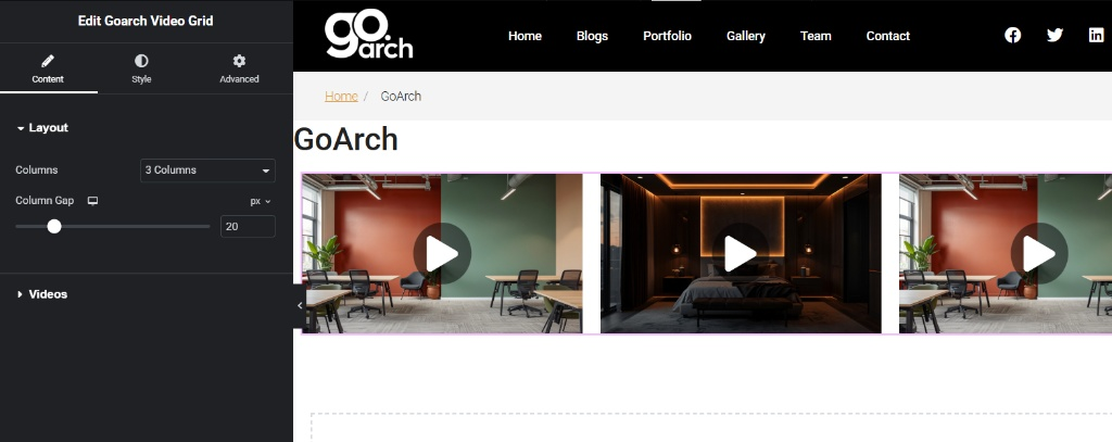
- Columns: Click this dropdown selection menu to control your grid’s horizontal density. Set this option to 3 Columns (as shown in
image_86a976.jpg) for a standard, well-balanced block distribution, or adjust it to fit fewer or more items per row. - Column Gap: Move this slider or input a raw pixel integer (e.g.,
20) to distribute clean breathing space between your video column blocks. Click the device icon next to this setting to apply distinct spacing rules tailored specifically for tablet or mobile screen breakpoints.
Videos Panel
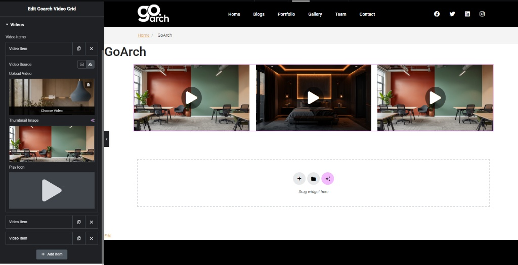
- Video Items List: An interactive drag-and-drop repeater dashboard. You can click the duplicate button to quickly clone a configured video frame row or click the X symbol to delete an item entirely. Expand an individual item row to modify its core options:
- Video Source: Toggle between the two layout icons to define where your asset file resides. Select the Media Icon to host and stream files directly from your WordPress media library, or select the alternative link icon to pull from external web URLs.
- Upload Video / Choose Video: Use this operational picker box to link or upload your target video clip asset (e.g.,
.mp4formatting strings). - Thumbnail Image: Click this media select thumbnail frame to upload a custom graphic cover or architectural render. This image functions as a high-resolution poster overlay that masks the video player until a user triggers the play icon.
- Play Icon: Choose or preview the specific graphical arrow overlay that appears on top of your video thumbnails to prompt user interaction.
- + Add Item: Tap this action button to append a fresh, blank video entry slide directly to the bottom of your existing media loop grid.
Style Tab
The Style tab houses your primary interface refinement tools, allowing you to manage container borders and calibrate play button interaction layouts.
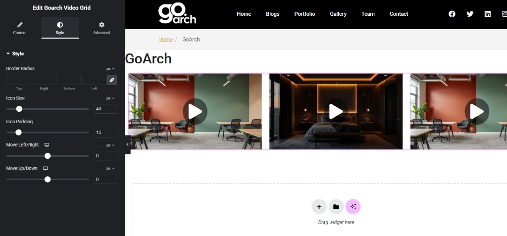
Style Panel
- Border Radius: Input explicit pixel padding constraints across the Top, Right, Bottom, and Left text fields to introduce sleek, rounded corners to your video card containers. Keep the link constraint icon toggled to apply symmetrical values across all four corners simultaneously.
- Icon Size: Adjust this slider tool or enter an explicit pixel metric (e.g.,
40) to scale the absolute dimensions of the centralized play button overlay. - Icon Padding: Use this entry field to apply internal spacing boundaries (e.g.,
15) around the play icon arrow symbol. This expands the clickable touch target zone and alters the outer circle background proportions. - Move Left/Right: A highly responsive horizontal coordinate offset slider. Leave this setting at
0to keep the play button perfectly centered horizontally, or slide it left or right to create stylized, asymmetrical button layouts. - Move Up/Down: A responsive vertical coordinate offset slider. Leave this setting at
0to keep the interaction play button perfectly centered vertically, or use positive/negative pixel offsets to anchor the play button closer to the header margins or bottom metadata lines.
Advanced Tab
The Advanced Tab features standard, framework-wide layout modification modules native to the Elementor core architecture. Use these configuration cards if your video section requires custom exterior margins, internal section paddings, scroll-triggered CSS motion entrance entrance effects, layout layer stacking priority index assignments (z-index), targeted developer CSS class/ID naming rules, or responsive visibility parameters to completely hide your video grid showcase across specific viewports like mobile phones or tablet screens.
Tips & Best Practices
- Optimize Local Media Assets: If you choose to use self-hosted media files via the Video Source media selector, pre-compress your video clips using an external compression utility before uploading. High-resolution, uncompressed video files can trigger heavy server load drops and slow down initial page rendering speeds.
- Enforce Uniform Cover Ratios: To guarantee your video items form a perfectly level grid matrix, ensure all images assigned to the Thumbnail Image slot share identical aspect ratios (such as standard 16:9 widescreen proportions). Consistent cover sizes prevent cards from rendering with mismatched vertical heights.
- Maintain High Play Icon Contrast: When styling your play button size and padding, ensure the icon color contrasts strongly against your cover thumbnails. If your imagery features bright lighting elements, pair them with a dark or semi-transparent circular play icon overlay to keep playback triggers instantly identifiable.
Troubleshooting
The video grid is causing the web page to load slowly or hitch on mobile devices
This issue typically indicates that multiple high-definition, uncompressed video assets are trying to load or pre-buffer simultaneously. To fix this performance bottleneck, compress your source video files, or transition your media pipeline by uploading your assets to dedicated external platforms (like YouTube or Vimeo) and linking them via the external link option under Video Source.
The play buttons look misplaced and are not centered inside the video frames
If your play buttons appear misaligned or pushed out of their central grid layout, check the Move Left/Right and Move Up/Down slider positions in your Style panel dashboard (as highlighted in image_86acbe.jpg). Reset both structural positional coordinate values back to 0 to instantly snap the play arrow overlays back to the perfect mathematical center of your video card covers.