
How Can We Help?
GoArch Dual Button
The Goarch Dual Button widget is an elegant, multi-purpose call-to-action (CTA) element designed for the Elementor page builder. It allows web designers to display two adjacent or stacked button triggers within a single container layout. Perfect for balancing dual consumer paths—such as “View Portfolio” next to “Contact Us”—this widget provides granular control over individual button boundaries, independent typography pairings, custom iconography, and responsive layout alignments.
Feature Overview
- Unified Layout Container: House and scale two distinct operational buttons side-by-side or stacked without needing complex inner section nesting.
- Independent Action Routing: Configure unique hyperlinks, target rules, custom labels, and specialized graphical icons for each button wrapper.
- Flexible Layout Formatting: Dynamically manage direction paths, responsive column spacing, and flex-box alignment distributions.
- Deep Architectural Styling: Fine-tune individual normal and hover interaction states, background gradients, custom borders, box shadows, and structural inner paddings.
Step-by-Step Instructions
Follow these instructions to implement and style a Goarch Dual Button configuration:
- Open your target template or page layout within the active Elementor development workspace.
- Search for Goarch Dual Button via the element widget selection tool directory on the left.
- Drag and drop the element block into a clean section column or layout grid component.
- Open the Overall Settings card under the Content tab to establish the baseline structural width and height dimensions.
- Expand the Left Button and Right Button parameter panels respectively to change your textual callouts, target URLs, and layout widths.
- Pivot directly into the Style tab to control the spatial gaps, direction flows, color palettes, custom borders, and typography options.
Explanation of Settings
Content Tab
The Content tab establishes your master layout dimensions and defines the core text strings, tracking URLs, and active asset nodes for each operational button.
Overall Settings Panel
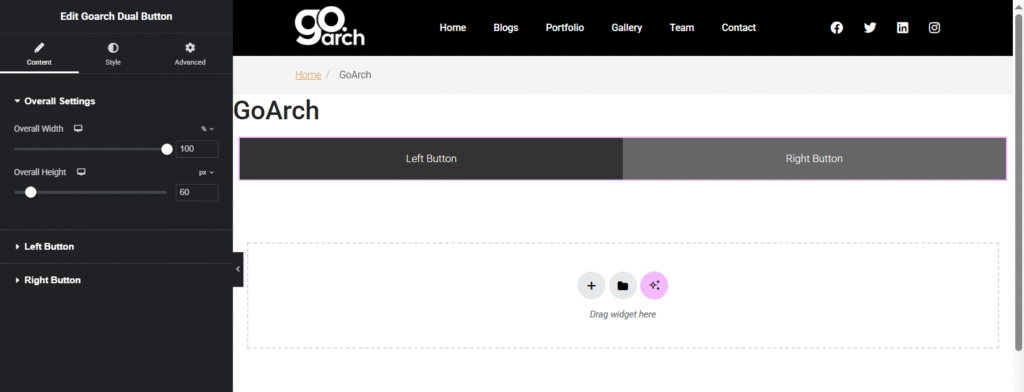
- Overall Width: Adjust this horizontal scaling slider or enter a raw percentage integer (e.g.,
100%) to control the maximum layout area occupied by the combined button frame inside its parent column block. - Overall Height: Move this slider tool or input an explicit pixel metric (e.g.,
60px) to establish the static baseline vertical height for the unified button element wrapper.
Left Button Panel
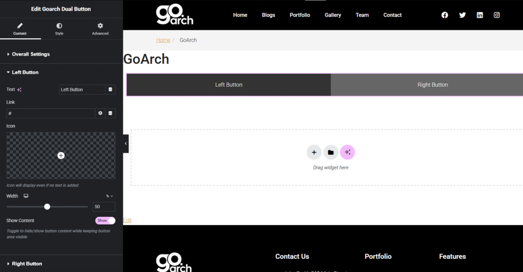
- Text: Enter your primary button call-to-action text string directly into this target input block field (e.g.,
Left Button). - Link: Specify the destination landing page web address or anchor URL tag string (e.g.,
#) where visitors will be redirected upon triggering the button click event. - Icon: Click the structural image slot or plus picker icon to append an inline graphic element from your SVG/FontAwesome asset media directory. Note: Icons will display on-screen even if no text content is added to the text string pool.
- Width: Declare the exact horizontal percentage space allotted specifically to this individual button component block (e.g.,
50%). - Show Content: Use this operational toggle switch to hide or show active button internal assets (like text rows and graphic icons) while ensuring the baseline button block area itself remains structurally visible on the template grid.
Right Button Panel
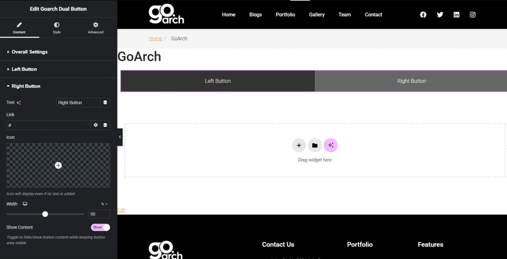
- Includes the exact same configuration parameters as the Left Button panel (Text, Link, Icon, Width, and Show Content toggle metrics) to map individual attributes exclusively to the right-hand action container row block.
Style Tab
The Style tab provides deep graphical customization over layout flows, individual button colorways, text rendering types, and structural container boundaries.
Layout Panel
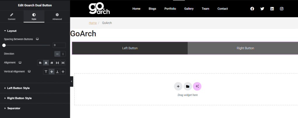
- Spacing Between Buttons: Use this slider tool to increase or decrease the physical pixel gap separating the two interior button boundaries. Set this to
0to lock them perfectly flush against one another. - Direction: Use the orientation toggle buttons to flip your dual layouts. Select horizontal layout formatting for side-by-side presentation columns, or switch to vertical layout formatting to stack buttons neatly on top of each other.
- Alignment: Select your preferred flex-box horizontal grid justification rows to snap the unified button asset structure to the left margin, center alignment line, right container wall, or distribute space equally across the canvas column.
- Vertical Alignment: Select your vertical layout positioning icons to align the interior contents to the top, middle, bottom, or stretch boundaries of the height constraint framework.
Left Button Style Panel
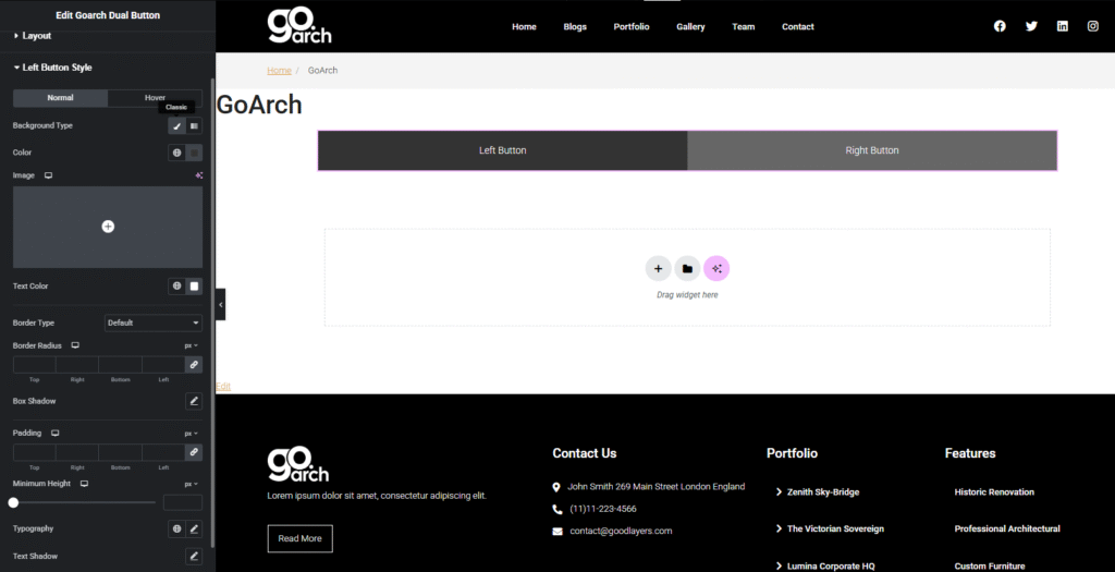
- Normal / Hover Tabs: Toggle between these design states to style standard presentation looks versus the responsive dynamic looks triggered when a user pointer rolls over the button link grid.
- Background Type: Click between the classic brush bucket icon or multi-stop gradient marker tool to assign flat color swatches, background cover imagery files, or fluid linear/radial gradient spectrum layers.
- Color / Text Color: Calibrate individual color pickers or click the globe icon to assign global theme hex swatches for the background framing layer and typography strings independently.
- Border Type: Choose your container edge treatment from a selection dropdown menu (e.g., None, Solid, Double, Dotted, Dashed).
- Border Radius: Input explicit pixel layout parameters across the Top, Right, Bottom, and Left edge slots to introduce corner styling configurations to the left element container boundary.
- Box Shadow / Text Shadow: Open these blurred structural offset windows to introduce subtle drop shadows behind the physical background card frame or behind the text typography layers.
- Padding: Apply precise directional pixel margins inside the inner button boundary walls to add breathing room around text elements and icon assets.
- Minimum Height: Calibrate an isolated vertical minimum measurement block constraint exclusively for this button component layout.
- Typography: Click the pencil controller symbol to launch the standard typography selection panel to style font family names, weights, size transformations, line height properties, and letter spacing boundaries.
Right Button Style Panel
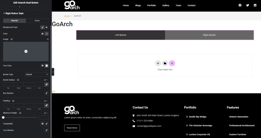
- Reflects the complete, independent feature suite provided inside the Left Button Style Panel. Use this section to map distinct, contrasting design palettes, typography styles, hover behaviors, and padding configurations exclusively to the secondary right-hand button block interface.
Separator Panel
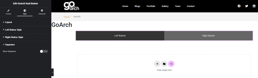
- Show Separator: Use this interactive toggle switch block (set to Hide or Show) to display or mask an explicit layout line or graphical divider ornament positioned right between your two button callout areas. When activated, additional styling slots unlock to easily adjust separator thickness parameters, style lines, color paints, and vertical heights.
Advanced Tab
The Advanced Tab includes standard, system-wide layout adjustments built directly into the Elementor infrastructure framework. Use these menus to apply precise external margin dimensions, customize parent section paddings, select scroll-driven CSS entry animations, assign layer stacking visibility priorities (z-index), set target developer custom CSS layout class/ID tags, or access responsive design rules to easily show or hide your dual button block structure across selected tablet screens, desktop computers, or mobile phone screens.
Tips & Best Practices
- Design for Clear Action Hierarchies: Avoid styling both button wrappers with identical background weights or high-contrast color values. Instead, use a solid color background for your primary action callout (e.g., Left Button Style) and style the secondary option (e.g., Right Button Style) with a minimal outline border block or neutral color tone to establish a clear visual hierarchy for visitors.
- Maintain Balance using Width Metrics: When configuring side-by-side placements, keep both button width fields set to
50%inside the Left Button and Right Button content panels to achieve perfectly symmetrical presentation columns. If one option features a significantly longer text string, adjust the width fields proportionately (e.g.,60%and40%) to prevent unnatural line breaks. - Keep Hover States Intuitive: Ensure your interactive hover states provide crisp, clear visual feedback. For example, if your standard button configuration features a transparent background with a solid accent outline border, design your hover settings to invert those assets on roll-over events.
Troubleshooting
The text content inside the button rows is wrapping awkwardly or breaking into multiple lines
This behavior typically occurs when long text strings are squeezed into layout constraints that are too narrow. To resolve this visual layout bug, navigate directly to the Content Tab -> Overall Settings Panel and increase your Overall Width percentage slider up to 100%. Alternatively, go to the Style Tab and adjust the font size properties down within the responsive Typography control screens for tablet or mobile views.
The two button blocks are stacked vertically but need to render side-by-side horizontally
Check the active configuration settings inside your Style Tab -> Layout Panel layout selector as illustrated in image_86bbc3.png. If your buttons are stacking vertically, the Direction option has likely been toggled to the vertical stack option. Simply click the horizontal icon indicator to instantly align the left and right button blocks side-by-side across a single row matrix.