
How Can We Help?
GoArch Blogs Loop
The Goarch Blogs Loop widget is a highly customizable dynamic post-rendering element engineered for the Elementor page builder. Specifically tailored to match modern architectural portfolios and editorial design layouts, this widget allows you to query internal WordPress posts and showcase them inside beautifully integrated text-overlay grids or balanced column cards. With advanced layout configurations, isolated color canvases, and comprehensive metadata management, it provides complete creative control over your blog indexes and category feed displays.
Feature Overview
- Dynamic Post Querying: Effortlessly fetch and sort specific post arrays based on custom limits, categorical filters, and ordering parameters.
- Structural Overlay Positioning: Choose how text elements overlay onto feature media cards with specialized multi-directional position maps.
- Isolated Grid Matrix Tuning: Fine-tune structural columns, internal gaps, and content balancing layout tracks seamlessly.
- Granular Typography Stack Styling: Access separate font size, weight, line margin, and hover color controllers across titles, description summaries, category blocks, and meta-data layers.
- Responsive Card Dimensions: Enforce hard pixel constraints on image container heights across desktop, tablet, and mobile breakpoints.
Step-by-Step Instructions
Follow these clear, step-by-step layout actions to deploy and configure a Goarch Blogs Loop section:
- Launch your target archive or theme page template inside your active Elementor page builder interface.
- Navigate to the left elements menu pane, search for Goarch Blogs Loop, and drag the widget block cleanly into an open section or column grid cell.
- Use the Content tab to establish post count thresholds, query filters, asset dimensions, and element visibility states.
- Move directly to the Style tab to craft your structural card containers, define padding footprints, and customize color schemes.
- Save your progress and update the layout to push the dynamic feed live.
Explanation of Settings
Content Tab
The Content tab routes your global post database queries and determines which metadata flags accompany your feature elements.
Content Panel
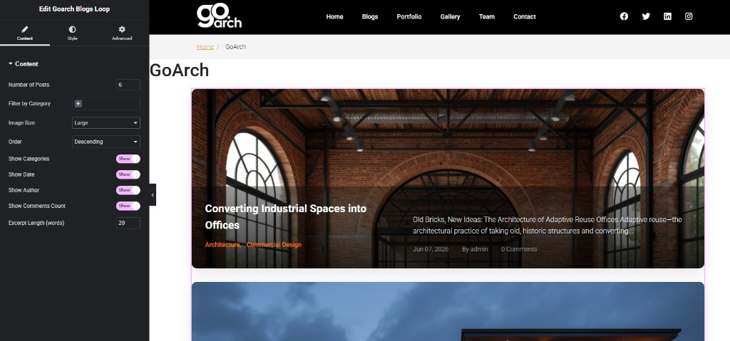
- Number of Posts: Enter the total capacity of item slots to display in the looping layout sequence. As illustrated across
image_ce7ffc.jpg, this is configured to 6 posts. - Filter by Category: Click the selection field (
+symbol) to isolate post loops to designated taxonomy groups or tags. - Image Size: Use this primary drop-down picker to set the standard resolution profile for featured media cards (set to Large in
image_ce7ffc.jpg). - Order: Sort the flow array using ascending (
Ascending) or descending (Descending) timelines to arrange posts by publication priority. - Show Categories / Show Date / Show Author / Show Comments Count: Master operational operational toggles. Turn these to Show to append metadata elements onto your grid elements automatically.
- Excerpt Length (words): Specify a strict word constraint limit to shorten summary text descriptions gracefully (configured to 20 words across
image_ce7ffc.jpg).
Style Tab
The Style tab provides an extensive array of panels to independently refine borders, background fills, structural spacing, and element alignment profiles.
Card Container Panel
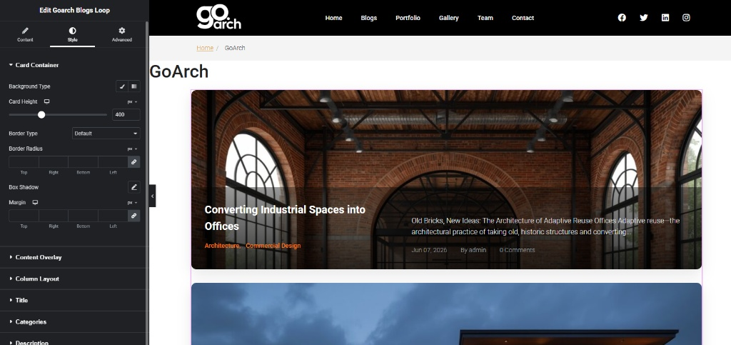
- Background Type: Click between standard color fill or gradient pickers to establish a clear master canvas backdrop underlying individual post items.
- Card Height: Set the precise height variable in pixels (
px) to ensure media containers look perfectly uniform across your loop grid. Inimage_ce803e.jpg, this value is fixed at 400px. - Border Type / Border Radius: Control the outline boundary geometry (set to Default across
image_ce803e.jpg) and slide to smooth out sharp structural edges. - Box Shadow / Margin: Apply modern depth blurs behind loop nodes or allocate external breathing boundaries between adjacent grids.
Content Overlay Panel
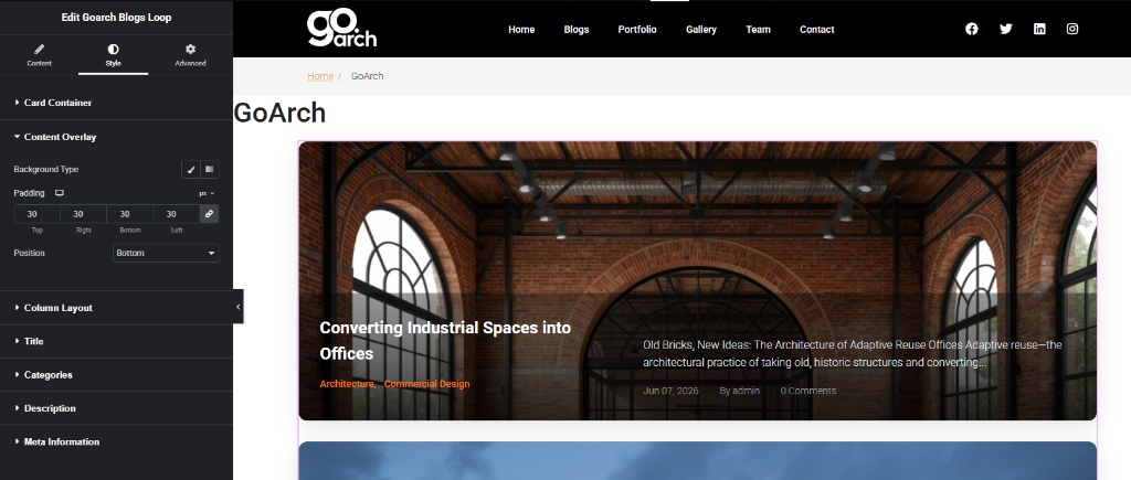
- Background Type: Apply semi-transparent darkening layers or rich overlay gradients directly onto images to maximize text readability.
- Padding: Input precise pixel parameters across all four quadrants to keep typography from hitting container boundaries. In
image_ce8304.jpg, a symmetrical spacing layout of 30px (Top, Right, Bottom, Left) is deployed. - Position: Pivot where the text box alignment container rests relative to the background framework (set to Bottom in
image_ce8304.jpg).
Column Layout Panel
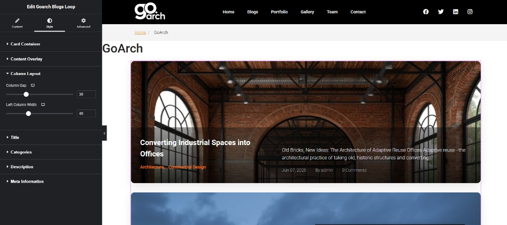
- Column Gap: Move the slider track to expand or shrink the gutter distance separating adjacent layout components from each other (set to 30 across
image_ce8327.jpg). - Left Column Width: Define precise percentage constraints to dynamically balance horizontal column structures (configured to 40% width in
image_ce8327.jpg).
Title Panel
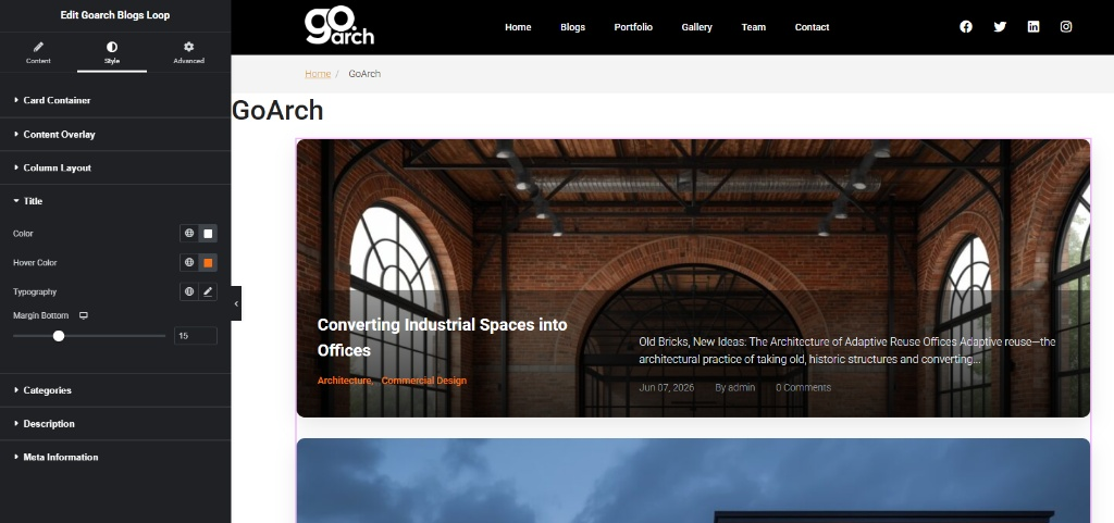
- Color & Hover Color: Pick distinct color pathways to transform entry titles when a visitor rolls their mouse cursor over the link.
- Typography: Modify font families, adjust standard character scaling parameters, and calibrate line heights.
- Margin Bottom: Establish a structural spacer gap below the main header layer to prevent elements from bunching up (set to 15px inside
image_ce8360.jpg).
Categories Panel
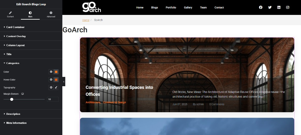
- Houses dedicated Color, Hover Color, and Typography rules crafted exclusively to frame category tax tags. Includes a customizable Margin Bottom option (set to 10px across
image_ce839d.jpg) to space taxonomy items cleanly from lower description layers.
Description Panel
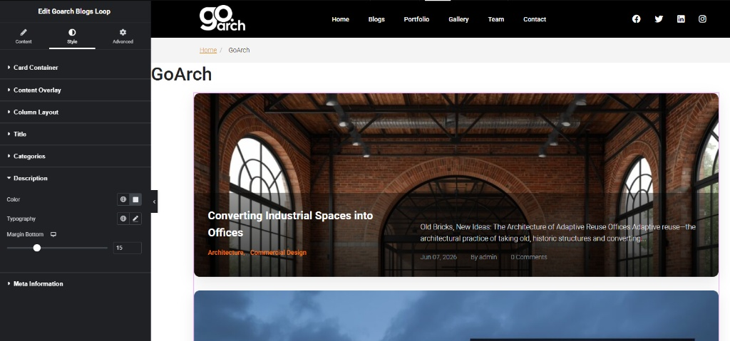
- Provides comprehensive textual controls over summary excerpts. Use the Color swatch tool and Typography configuration menus to adjust body text layers while setting an anchor gap via Margin Bottom (set to 15px in ).
Meta Information Panel
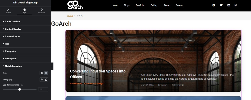
- Adjusts author strings, date stamps, and comment count parameters simultaneously. Fine-tune item aesthetics using global theme text palettes and typography settings, and move the Gap Between Items slider (configured to 15px in ) to neatly separate metadata fields along horizontal text rows.
Advanced Tab
The Advanced Tab includes standard, system-wide custom features native to the core Elementor infrastructure engine. Use these panels if your loop template grid requires external margins, entrance animation wrappers, custom z-index stack positioning layers, localized CSS class definitions, or responsive design visibility rules to hide or show your blog loops completely across specific screen dimensions.
Tips & Best Practices
- Optimize Excerpt Formatting: Maintain balanced visual proportions across loops by aligning your text sizes with excerpt boundaries. When combining an Excerpt Length threshold of 20 words (
image_ce7ffc.jpg) with an inner overlay padding of 30px, verify your excerpt text does not clip past the boundaries of your 400px fixed container framework. - Preserve Text Contrast: When embedding overlay content directly on top of images (using the Position: Bottom layout, always configure a semi-transparent dark shade under Content Overlay -> Background Type. This step adds contrast to protect white title elements from getting washed out by bright blog graphics.
- Check Mobile Breakpoint Limits: Hard-coded spatial properties (like setting a Column Gap parameter of 30 or an explicit column breakdown footprint) should be checked across responsive viewports. Use the mobile screen preview switch toggles right next to layout fields to keep grids from displaying cramped text segments on narrower phone screens.
Troubleshooting
The loop structure displays identical placeholder posts or empty layout slots
Verify that your query settings match active data channels. Jump back into your Content Tab -> Content Panel and inspect the Filter by Category field. If a category tag is specified but contains zero published posts under it, the layout engine will have no data arrays to display on screen.
Title and meta text strings are overlapping on the front end
This issue generally stems from mismatched margin distributions or over-compressed item settings. Navigate to the Style Tab and ensure that you have configured appropriate line buffers under Title -> Margin Bottom (15px), Categories -> Margin Bottom (10px), and Description -> Margin Bottom (15px) to distribute dynamic block elements evenly across the card landscape.